
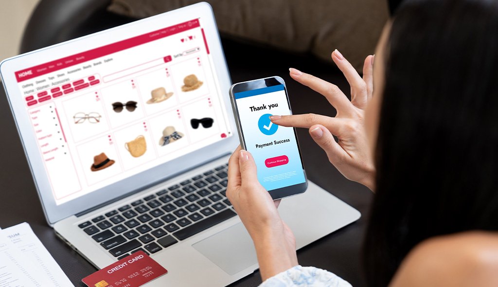
Shoppers move between mobile apps, browsers, kiosks, wearables, and voice assistants without a second thought. Your storefront needs to keep up. Headless commerce UX gives your business the flexibility to deliver consistent experiences across every channel while allowing design and engineering teams to work in parallel. For brands scaling into new markets or new devices, the shift from monolithic platforms to decoupled architectures is no longer a nice-to-have. This blog explains how to design headless storefronts that grow with your business, hold up under real traffic, and keep customers engaged across every touchpoint they use to interact with your brand today and every one they will adopt tomorrow.
Headless commerce separates the front end (what shoppers see) from the back end (product data, pricing, inventory, and checkout logic). The two communicate through APIs. Headless commerce UX is the discipline of designing customer-facing experiences on top of that separation, so each channel gets an interface built for its context without duplicating backend logic. It is not just a technical shift. It is a design opportunity, because the same commerce engine can now support very different customer journeys.
According to the MACH Alliance, composable and headless architectures are becoming the default choice for enterprises that need speed and flexibility. For your business, this means your product catalog can power a website, a native app, an in-store screen, a marketplace listing, and a smart speaker without forcing all five to look or behave the same way. Design becomes a first-class part of your commerce stack rather than a template layered over it after the fact.
Monolithic platforms bundle presentation and commerce logic together. That worked when desktop web was the only serious channel. It falls short today when shoppers expect fluid movement between devices, apps, and physical stores.
Nielsen Norman Group research on omnichannel user experience has long shown that customers expect continuity across devices. When they cannot get it, trust drops and conversion drops with it. Your business ends up paying for the same customer twice: once to acquire them on one channel, and again to reintroduce your brand on the next.
Designing for headless means thinking beyond a single screen. A few principles guide teams that get it right and keep their storefronts flexible over time.
Each touchpoint has its own constraints. A wearable does not need the same navigation as a desktop grid. Build interfaces around user context, not backend convenience. A shopper checking stock in-store wants a different flow than one browsing on a tablet at home.
Tokens, components, and content models should be reusable. This keeps your brand recognizable while letting each channel breathe. Our team at UX Stalwarts often helps clients set this up through structured UX design services that support long-term scale rather than one-off launches. A mature design system is what stops your storefront from fragmenting as channels multiply.
Product content should be structured so it can render as a card, a voice reply, a push notification, or a full detail page. Model your content once and reuse it everywhere. This is where close collaboration between design, content, and commerce teams starts paying off in shipping speed and shopper clarity.
API-driven storefronts can be lightning fast or painfully slow. Design decisions such as image handling, lazy loading, skeleton states, and cache strategies directly shape perceived speed. Google’s guidance on Core Web Vitals is a useful benchmark to plan against, and every channel should be measured on its own performance targets rather than a single web-only score.
A shopper’s preferences, cart, and history should follow them across devices. Design flows should anticipate this, not treat each channel as a first visit. A returning customer opening your app after browsing on desktop should pick up exactly where they left off, with the same recommendations, saved items, and applied promotions. Portable personalization also protects your business from over-relying on cookies or single-channel identifiers as privacy rules tighten across markets.
When multiple teams contribute to a single storefront, small differences add up. A merchandiser in Stockholm might tag a product differently than one in Franklin. Design governance, editorial workflows, and clear ownership of components keep the experience coherent as your storefront scales. Set review cadences, publish a component contribution guide, and give business teams a safe sandbox to test channel-specific ideas before they go live.
The same product can appear on a smart TV interface, a mobile progressive web app, and a physical kiosk. Each surface has different expectations, and good headless UX respects them without forking your codebase into unmanageable branches.
A well-designed headless UX respects these differences without fragmenting the brand. For enterprises expanding regionally, this matters even more. Teams working across Noida, Franklin, and Stockholm bring context on how shoppers behave differently in India, the United States, and Europe, and your design system should reflect that variation. Currency, payment method preferences, delivery expectations, and even scroll behavior differ by region, and your storefront should adjust without maintaining separate codebases for each market.
Even experienced teams stumble on the same issues when they move to a headless setup. Watch for these patterns early.
McKinsey’s research on omnichannel retail consistently notes that unified customer data and consistent experiences separate top performers from the rest. Design owns a larger share of that outcome than most business leaders assume.
Future-proofing is less about predicting technology and more about building for change. The goal is to reduce the cost of your next channel, your next market, and your next platform swap.
Your storefront is not a project with an end date. It is a product that keeps evolving as channels multiply and shopper habits shift. Businesses that treat it that way spend less on rebuilds and gain more from each new channel they add. Consider running quarterly reviews of your design system and channel performance to catch drift early, before it becomes a rewrite.
Headless commerce UX is how your business stays useful to customers across every screen they own and every one they will adopt next. Get the fundamentals right, including a shared design system, portable content, channel-aware interfaces, and unbroken performance, and your storefront will scale without breaking. The brands that treat design as a strategic partner to their headless stack, not a downstream deliverable, are the ones that hold on to shoppers across markets and devices. If you are planning a headless move or fixing one already in motion, working with a partner that has shipped multi-channel commerce across retail, fintech, and enterprise for over 18 years can save you costly rework. Talk to our team about your storefront roadmap.
It is the design of shopper-facing experiences on a commerce platform where the front end is decoupled from the back end. This lets your business build tailored interfaces for web, mobile, voice, in-store, and other channels while sharing one commerce engine, one product catalog, and one source of truth for customer data.
It removes the presentation constraints of monolithic platforms. Designers can craft channel-specific journeys, ship updates faster, and personalize experiences without waiting on backend releases. Shoppers get faster, more consistent experiences no matter where they engage with your brand.
Consider it when you are expanding to new channels, entering new markets, or when your current platform slows down design and content updates. Businesses with complex catalogs, global operations, or aggressive personalization roadmaps tend to see the largest gains from moving to a headless model.
It depends on your goals. Traditional platforms are simpler for single-channel stores with limited customization needs. Headless is stronger for brands that need flexibility, speed, and multi-channel reach. Many mid-market and enterprise brands adopt a hybrid path, keeping certain modules while decoupling the storefront.
Maintaining brand consistency across channels, keeping checkout smooth, ensuring performance stays fast, and building a design system that scales without becoming rigid. Accessibility and analytics parity across channels are also common blind spots that trip up otherwise well-run projects.
Track conversion rate per channel, task completion times, cross-channel cart continuity, page performance scores, and customer satisfaction metrics. A unified analytics layer that captures the same events across web, app, and in-store screens makes this measurement possible and comparable.

C – 81C, Sector – 8, Noida 201301, India


1025 Beamon Drive, Franklin 37064 Tennessee, USA
Sveavagen 34 111 34 Stockholm, Sweden
A-10, Sahastradhara Rd, Doon IT Park, Dehradun, Uttarakhand

© 2026 UX STALWARTS. All rights reserved.

