
Interfaces that work but look inconsistent lose trust the moment a user switches between screens. Marketing assets built without a shared visual language create friction at every touchpoint, from website to email to pitch deck. Typography choices made ad hoc by different teams result in brand perception that feels fragmented rather than deliberate. These issues do not show up as feature failures or broken flows. They show up as doubt. Users and prospects notice when something feels off even when they cannot name it. That perception affects conversion rates, brand recall, and the willingness of decision-makers to take your organization seriously in competitive evaluations.
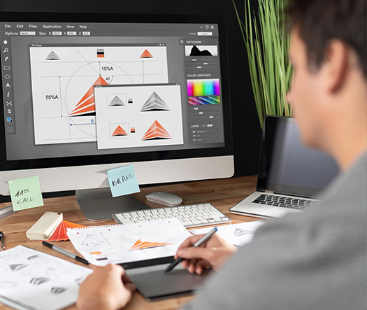
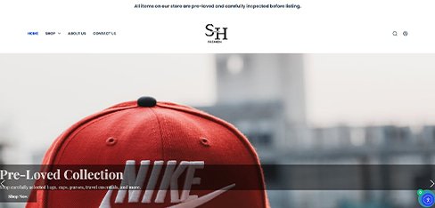
UX Stalwarts delivers visual design services that unify how your brand presents itself across every surface. The scope spans typography systems, color architecture, iconography libraries, illustration direction, photography treatment, and visual hierarchy frameworks applied to websites, product interfaces, campaign assets, and audio visual design services for presentations and digital signage. Each engagement produces a documented visual language with clear usage rules rather than a set of one-off creative outputs. Whether the need is ui visual design services for a SaaS platform, brand visual design services for marketing material, or website visual redesign services for an outdated digital presence, the deliverable is a coherent visual system your teams can apply confidently.
With eighteen years of design delivery across more than a thousand engagements, the experience behind every visual design project extends beyond aesthetic preference. The approach treats visual craft as a strategic discipline grounded in cognitive perception, reading patterns, and cultural context. Where many agencies deliver visuals that look polished in isolation but fail to perform under real-world conditions, this practice validates visual decisions against accessibility standards, device variations, and cross-platform rendering. That combination of aesthetic sensibility and systematic rigor is what makes a creative visual design agency useful beyond the initial launch and into the years that follow.

Every engagement produces a documented visual system rather than a collection of disconnected deliverables. Typography rules, color tokens, spacing scales, and imagery guidelines are captured in a reference guide your teams can apply independently. The investment pays off long after launch because the system governs every new asset produced.

Visual hierarchy is built around how the human eye processes information across reading patterns, scan paths, and attention priorities. Size, weight, color, contrast, and spacing are deliberately calibrated to guide users through content in the intended order, not arranged by taste alone. This grounding in perception makes interfaces usable.

Color contrast ratios meet WCAG 2.1 AA standards across all text and interactive elements. Typography sizes respect minimum legibility thresholds at every breakpoint. Iconography includes text labels or ARIA descriptions for screen readers. Accessibility is embedded in visual decisions from the start, not retrofitted after design is complete.

Visual elements are tested and optimized for rendering across desktop, tablet, mobile, email clients, and print environments. Font fallbacks, image compression strategies, and color profile management ensure that visuals maintain their intended impact regardless of where they appear. This consistency strengthens brand recognition at every touchpoint.

Most organizations struggle with visual inconsistency between their marketing site and their actual product. This practice bridges that gap by producing one visual language that governs both contexts, with appropriate variations documented for each. The result is a coherent brand experience from first marketing impression through daily product use.

Visual systems are delivered with usage documentation that covers when to apply specific typography styles, how to compose layouts, and what combinations to avoid. New team members onboard faster because the documentation answers questions before they are asked. This reduces dependency on individual designers for ongoing visual decisions.
When visual design is strategic rather than decorative, every asset your organization produces works harder. Marketing materials generate stronger recall because the visual signature is consistent. Product interfaces build trust faster because the aesthetic matches user expectations for quality and professionalism. Sales decks close better because they feel deliberate rather than assembled. Pitch materials hold attention longer because hierarchy directs the eye through the argument. The digital visual design services delivered in each engagement combine perceptual psychology, cultural awareness, and technical precision to ensure every visual decision contributes to measurable outcomes rather than existing purely for appearance.
Work with a visual design agency that prioritizes strategic coherence.
This structured method ensures every visual decision is grounded in audience context, brand strategy, and real-world deployment conditions.

We review your current visual assets across website, product, marketing, and internal communications to document inconsistencies, missing elements, and opportunities. The audit identifies which typography, color, and imagery patterns are performing well and which are causing brand dilution. The output is a prioritized roadmap for visual unification.

A complete typography system is developed covering primary and secondary typefaces, weight and size scales, line height relationships, and use cases for each style. Fallback fonts are specified for performance-constrained environments. The system supports readability across languages and scripts relevant to your audience without introducing visual fragmentation.

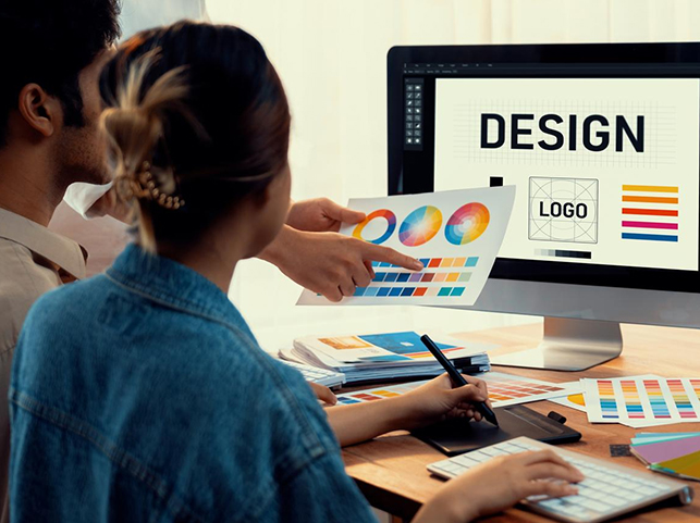
A structured color palette is built with primary, secondary, and accent hues defined alongside semantic colors for success, warning, and error states. Each color is tested against accessibility standards and rendered for print, screen, and environmental variations. The architecture supports theming, dark mode, and multi-brand applications where applicable.

Illustration direction, photography treatment rules, and icon library standards are defined. The phase produces visual guidelines covering composition, subject framing, color grading, and style consistency. Iconography is drawn to a unified stroke weight and geometry. These assets shape how your brand feels human, modern, or professional across every touchpoint.

Layout principles are established for how typography, color, and imagery combine within specific surfaces. Visual hierarchy rules ensure that priority content receives appropriate emphasis through size, weight, and placement. These principles are demonstrated through template layouts for the most common content types your teams produce regularly.

Every decision is captured in visual documentation covering usage rules, do-and-do-not examples, and implementation notes for designers and developers. A handover session trains your team on the system. For organizations adopting the visual language across existing assets, a prioritized rollout plan sequences updates by impact and urgency.
Across more than 1,000 client engagements and diverse industries, explore how strategic visual craft has reinforced brand equity measurably.
The visual treatment appropriate for an enterprise financial platform differs fundamentally from a consumer wellness app or a public-sector service portal. Each engagement starts with the specific audience expectations, cultural associations, and regulatory visual requirements of your sector. From startups defining their first visual system to enterprises unifying visual presence across acquired business units, the approach adapts to match organizational complexity and content volume.
Cross-sector experience spanning financial services, healthcare, education, retail, SaaS platforms, logistics, media, and government digital services informs every visual decision. When a healthcare platform needs visual treatments that balance clinical credibility with patient approachability, or when a fintech product requires a visual system that conveys both trust and innovation, that domain knowledge shapes typography choices, color psychology decisions, and imagery direction throughout the engagement.

When organizations evaluate a professional website visual design company or a broader visual design partner, portfolio quality matters but tells only part of the story. The real differentiator is whether the partner produces visual systems that teams can apply independently over years. Recognition earned through long-term client relationships reflects that deeper standard of usefulness.
Systematic, Not Decorative: Every visual decision is part of a documented system with defined rules, making outcomes reproducible and scalable across teams.
Cross-Disciplinary Craft: Typography, color, imagery, and hierarchy are treated as interconnected disciplines rather than isolated choices, producing visual systems with coherent internal logic.
Measurable Visual Outcomes: Visual decisions are validated against measurable metrics like recall, readability, and conversion rather than remaining in the realm of subjective taste.
Each visual design project uses industry-standard tools selected for precision, collaboration, and production-ready output. Technology choices ensure deliverables integrate cleanly with your existing design and development workflows.


UX Stalwarts transformed TechFlow from forgettable to iconic. Brand recognition soaring from 12 to 67 percent proved visual design drives awareness. Deal closure improving from 23 to 41 percent showed enterprise buyers value professional brand identity. Marketing efficiency increasing 80 percent and Series B success at $28 million validated the strategic investment.
UX Stalwarts solved our presentation productivity crisis elegantly. Reducing deck production from 50 to 13.5 hours per project transformed our efficiency completely. Client satisfaction jumping from 7.8 to 9.2 and win rate growing from 42 to 67 percent proved professional visual design drives business results. Annual savings of $680,000 delivered clear ROI.
UX Stalwarts elevated StyleHub’s marketing visuals from generic to iconic. Campaign performance increasing 267 percent and social engagement jumping from 2.1 to 7.8 percent proved visual design drives results. CAC dropping from $67 to $39 and $4.8 million revenue impact validated the investment. The visual system transformed our marketing effectiveness completely.
Practical answers to the questions teams ask before investing in visual craft.
Visual design services focus on the strategic craft layer of visual expression across digital and physical surfaces. The scope covers typography systems, color architecture, iconography, illustration direction, imagery strategy, and visual hierarchy applied as a unified language. Graphic design is a broader, older discipline that covers print, packaging, and advertising often as standalone deliverables. UI design is more specific to interface interaction patterns and component behavior. Visual design sits between them, focusing on how the visual elements look and feel across all touchpoints rather than how individual components function. Organizations typically need visual design when they want coherent aesthetic expression across marketing, product, and internal communications. Selecting Visual Design Services firms with disciplined craft frameworks helps reduce aesthetic drift across teams.
Costs vary based on scope and the number of surfaces covered. A focused visual language project covering typography, color, and basic iconography for a single brand typically ranges from $8,000 to $25,000. A comprehensive visual system covering product interfaces, marketing assets, photography direction, illustration style, and audio visual design services for presentations can range from $25,000 to $80,000. Enterprise engagements spanning multiple brands, languages, and deployment environments may range from $60,000 to $200,000. Affordable visual design services are available for startups and early-stage companies through focused scope management. A detailed assessment based on your specific surfaces and volume is the most accurate way to establish budgets. Buyers typically evaluate professional Visual Design Services and affordable visual design services alongside boutique Affordable Visual Design Agency partners to compare scope, depth, and pricing transparency.
Brand identity defines who you are as an organization: logo, brand marks, brand voice, positioning, and the high-level personality of the brand. Visual design applies that identity across every surface where it needs to be expressed: website, product, marketing, presentations, social, and internal tools. Brand identity typically answers strategic questions about what the brand stands for. Visual design answers execution questions about how that identity shows up in every specific context. Both are necessary and complementary. If you already have brand guidelines but notice inconsistent visual execution across assets, you need visual design. Our brand identity services cover the foundational work that precedes visual design application. Brand Visual Design Services then bridge identity guidelines with consistent execution across every customer-facing surface.
A focused visual design engagement for a single brand with one primary surface typically takes six to ten weeks. A comprehensive visual system covering typography, color, iconography, illustration direction, and visual hierarchy for multiple surfaces usually requires ten to sixteen weeks. Enterprise-scale projects with multi-brand architecture, accessibility compliance across all elements, and full documentation rollout can extend to six months or more. Timelines depend on approval cycles, the number of stakeholders involved, and whether brand identity work needs to happen first. Organizations with established brand guidelines and clear decision-making structures move considerably faster than those defining their identity concurrently with visual execution. Engaging Visual Design consultant Services early in planning helps right-size scope and prevents late-stage rework.
Yes. Many engagements begin with a visual refresh rather than a complete rebuild. The approach identifies which visual elements are creating brand fragmentation and replaces them systematically without altering underlying layouts, navigation, or functionality. Typography updates, color palette refinement, iconography standardization, and imagery treatment changes can deliver significant perceptual improvement with modest implementation effort. This approach is particularly valuable for products that function well structurally but feel visually outdated or inconsistent. Website visual redesign services focused on the craft layer often deliver measurable improvements in conversion and engagement without the cost and risk of a full product rebuild. Targeted Website Visual Design services often deliver stronger perceived quality than complete rebuilds when underlying flows already perform reliably.
UI visual design services cover the visual craft layer applied specifically to product interfaces. This includes typography scales for interface content, semantic color systems for interactive states, iconography libraries for navigation and actions, spacing and density rules for layout composition, imagery treatment for in-product content, and visual hierarchy frameworks for complex screens like dashboards and data tables. The work integrates with broader interface architecture but focuses on aesthetic coherence rather than interaction patterns or component behavior. For organizations looking to refine how their product looks while maintaining existing functionality, ui visual design services deliver measurable improvements to perceived quality, user trust, and overall brand alignment.
Audio visual design services cover visual design applied to multimedia contexts including presentation decks, digital signage, event displays, webinar backgrounds, video thumbnails, and interactive installations. The scope combines typography, layout, color, and imagery design with considerations for motion readiness, projection legibility, and cross-format scaling. Organizations need these services when they host events or conferences, deploy digital signage in retail or corporate environments, produce regular webinars or video content, or create investor and board presentations that require polish beyond default template design. This specialization ensures visual consistency extends from digital surfaces into live and multimedia contexts where generic design tools fall short. A Digital Visual Design Agency typically coordinates these multimedia surfaces with broader product and marketing visual systems for full consistency.
Visual design affects user experience through perceived quality, trust, readability, and cognitive load. Well-crafted visual hierarchy reduces the time users need to locate and understand information. Consistent typography and color reinforce brand recognition, which correlates with trust and willingness to transact. Accessible color contrast and legible type sizes improve task completion rates across diverse user groups. Studies consistently show that websites with refined visual design achieve higher conversion rates, longer session durations, and lower bounce rates than competitors with comparable functionality but weaker visual execution. Visual craft is not decoration. It is a performance layer that influences every metric tied to user attention and engagement. For this reason, digital visual design services are treated as a measurable performance investment rather than a decorative layer.
The primary tools include Figma for interface and collaborative design work, Adobe Illustrator for vector illustration and iconography, Adobe Photoshop for photography editing and complex imagery, and Adobe InDesign for presentation and print layout. Sketch remains in use at many organizations for interface design. Glyphs is used for custom typography and logo lettering. Adobe Color and Contrast Checker validate color palettes against accessibility standards. For organizations building comprehensive visual systems that feed into product interfaces, tool choices must align with your existing design and development workflows. The output format and documentation structure matter more than the specific software used to produce them. A professional website visual design company aligns these tools with your engineering stack so handoffs remain clean and consistent.
Marketing visual design services focus on external-facing assets: website, landing pages, campaign creative, social content, email templates, pitch decks, and advertising. The goal is to attract attention, communicate value propositions, and drive conversion. Product visual design focuses on the visual craft layer within the product itself: dashboard design, form styling, data visualization, empty states, and navigation aesthetics. The goal here is to support task completion, build trust, and maintain brand alignment during daily use. Both require the same underlying visual language but apply it with different priorities. Organizations typically need both, governed by one shared visual system to prevent perception fragmentation between marketing promise and product delivery.
A creative visual design company specializes specifically in the visual craft layer rather than offering visual design as one bullet within a broader UI/UX or branding package. This focus typically produces deeper typography expertise, more rigorous color architecture, and more intentional iconography and illustration work. Full-service agencies deliver broader coverage but may apply less specialized attention to each visual dimension. For organizations that already have UI/UX and product design capability but need dedicated visual craft expertise, a specialized visual design partner delivers stronger outcomes. For organizations building complete digital products from scratch, a broader mockup design services engagement may be more practical. Evaluating a creative visual design agency against integrated Visual Design Services firms helps clarify whether you need specialist depth or broader cross-discipline coverage.
Yes. Visual design work integrates directly with design system infrastructure through shared tokens for typography, color, spacing, and iconography. In many cases, refining the visual layer of an existing design system is more valuable than building a new system. The process begins with auditing existing tokens and components to identify inconsistencies, gaps, and misalignments with brand guidelines. Refined visual decisions are then documented as updates to the system and rolled out through governance workflows. For organizations maintaining comprehensive design system infrastructure, this visual refinement work complements the broader design system creation services that govern systematic component architecture.
Accessibility is embedded into every visual decision from the earliest phases. Color palettes are tested against WCAG 2.1 AA contrast ratios for all text and interactive elements. Typography scales are validated for legibility at minimum sizes across devices and screen densities. Iconography is accompanied by text labels or ARIA attributes to ensure screen reader compatibility. Color is never the sole indicator of meaning because users with color vision deficiencies must still perceive state changes through alternative visual cues. Focus states are designed deliberately to support keyboard navigation. This integrated approach ensures accessibility compliance is a natural outcome of the visual design process rather than a separate audit layer added later.
Every industry benefits from strategic visual design, but the impact is most measurable in sectors where brand perception directly affects revenue or trust. Financial services gain conversion lift from visual treatments that signal reliability and sophistication. Healthcare platforms build patient trust through visual systems that balance clinical credibility with human warmth. SaaS products reduce churn by delivering visual polish that matches user expectations for quality. E-commerce brands achieve higher average order values through imagery and typography that convey product quality. Education technology platforms improve engagement through visual systems that respect learner attention. Custom visual design solutions adapt these principles to the specific expectations and constraints of your industry context. Working with a Digital Visual Design Agency familiar with sector-specific compliance accelerates these gains, while an Affordable Visual Design Agency model extends access to early-stage organizations needing the same craft standards.
Getting started requires an initial conversation about your current visual state, brand goals, target surfaces, and timeline. Helpful materials include existing brand guidelines, current website or product screenshots, marketing assets, competitor visual references, and any previous design documentation. From there, a scope proposal outlines the recommended engagement phases, deliverables, timeline, and investment. For organizations evaluating how to measure visual design impact before committing, our insights on quantifying UX return on investment provide a practical framework for connecting visual design investments to business outcomes such as conversion, retention, and brand recall. Many engagements begin as focused Website Visual Design services or short Visual Design consultant Services before expanding into broader, full-system rollouts.

C – 81C, Sector – 8, Noida 201301, India


1025 Beamon Drive, Franklin 37064 Tennessee, USA
Sveavagen 34 111 34 Stockholm, Sweden
A-10, Sahastradhara Rd, Doon IT Park, Dehradun, Uttarakhand
© 2026 UX STALWARTS. All rights reserved.


