
A digital product can work just fine and still fail on a commercial level because its visual layer puts off the very people it was created for. When typography looks cluttered, color systems are incoherent, interactive states are confusing rather than guiding, or mobile layouts break on mid-range devices, the harm is more than aesthetic. Conversion rates erode because prospects can’t distinguish between elements that actually do something and static content. Brand perception is negatively impacted when visual inconsistency indicates a lack of professionalism or attention to detail. For organizations that work across mobile, web, and embedded platforms, disjointed UI design services from disconnected vendors add to these problems by creating interfaces that look and behave differently at every touchpoint, undercutting the unified brand experience modern buyers expect.
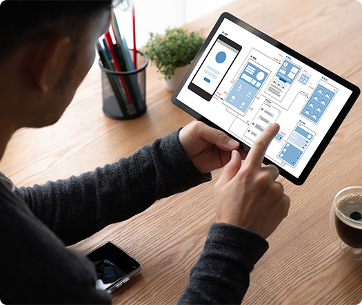
UX Stalwarts provides user interface design via a systematic visual approach that starts where interaction strategy leaves off. Once the user flows, wireframes, and information architecture have been validated, the visual design phase turns structure into a coherent expression of the brand. This includes typographic scale systems, color token libraries, iconography suites, spacing and grid frameworks, responsive breakpoint specifications, as well as interactive-state definitions for hover, focus, active, disabled, and error states. Whether the brief is for mobile UI design for a consumer application, a data-dense enterprise dashboard, or conversational user interface design for an AI-powered service layer, every screen is produced at production fidelity and annotated for precise developer handoff.
With eighteen years of visual design delivery over one thousand two hundred and fifty engagements, this UI design company brings pattern maturity unattainable by short-tenured studios and freelance user interface designers. The visual design team works at the intersection of brand strategy, interaction logic, and front-end feasibility, creating interfaces that look exceptional, perform predictably across browsers and devices, and provide accessibility contrast ratios required by WCAG 2.1 AA. Where in many UI design firms the visual layer is the cosmetic finish applied after engineering, the practice here positions interface design as a strategic function that has a direct influence on perception, trust, and commercial outcomes. This ui design company india supports global product teams from a delivery base built for cross-border collaboration.

Selecting a brand-aware ui agency at this stage protects long-term equity.
Interface design starts with a deep dive into your brand’s existing visual language or, if needed, the development of one. Color palettes, typographic hierarchies, and styles of illustration are not applied to templates, but instead are derived from brand positioning. This discipline is dedicated to ensuring that all screens contribute to brand recognition and that organizations engaging with this UI design agency are given interfaces that feel like their own, not interchangeable with competitor products.

Every button, input field, card, modal, and navigation element is designed as a versioned component with documented states, spacing rules, and responsive behavior. This component-first approach is a boon to engineering velocity because developers get a complete, unambiguous specification in place of flat mockups that have to be interpreted. User interface design companies that do not have a rigorous design process are creating a visual debt that will slow down the delivery of features for years.

Mobile application UI design is not counted as a scaled-down version of desktop screens. Touch target sizing, gesture-based navigation, safe area handling for notched displays, and platform-specific conventions for iOS and Android are considered for every mobile layout from the first pixel. Teams that are hiring a user interface designer for mobile products should check for this platform-aware capability before they sign any engagement.

Contrast ratios, focus indicators, color-blind-safe palettes, and legible type sizing at small viewport widths are regarded as part of the visual design rather than a post-production task to make things fit. Automated accessibility scans are performed against all component variants,s and manual review identifies edge cases that are not found by tooling. This rigor means the services delivered in the form of UI design are inclusive by default, which reduces legal exposure and increases audience reach.

As interaction paradigms shift towards voice, chat, and AI-mediated interactions, the practice has evolved visual frameworks for conversational user interface design that ensure brand coherence within messaging containers, chatbot panels, and multimodal voice-plus-screen environments. Organizations that are investing in AI-powered customer touchpoints require their UI design service to step beyond the traditional screen layout and into these emerging contexts. A specialist ui consultant can map these emerging surfaces against your roadmap.

Deliverables are designed for direct consumption by engineering teams: auto-layout-based Figma components, exported design tokens in formats for JSON and CSS custom properties, redline annotations, and responsive behavior specifications. This removes the gap in interpretation that usually leads to visual drift between approved designs and shipped code (a persistent problem when UI design companies pass off handoff as an informal file share rather than a governed process).
User interface design is the layer that your customers actually see and judge within the first fifty milliseconds of a page load. It influences whether or not a prospect will think your product is trustworthy, high quality, and worthy of further exploration, or close the tab and go to a competitor. Strong visual systems do more than appeal to an aesthetic taste; they build cognitive shortcuts leading to attention for primary actions, avoiding decision fatigue with consistency patterns, and reinforcing brand memory across every session. Effective UI designing agency partnerships extend beyond creating beautiful screens to the engineering of a visual language that scales well across platforms, is robust enough to stand up to feature growth, and preserves coherence as your product evolves. The interface designers behind this practice are combining typographic expertise, color theory, motion literacy, and front-end awareness to make sure all visual decisions are both beautiful and buildable. For many buyers, this is what separates the best ui design agency from a vendor that simply ships screens.
Engage a specialist user interface design company to create order, clarity, and brand strength for every pixel. Custom ui design services are scoped to your product surface, brand maturity, and engineering cadence.
A disciplined, repeatable visual design process helps ensure that creative exploration is grounded in brand strategy, user needs, and engineering constraints.

An inventory of the existing visual assets, including color usage, typographical inconsistencies, icon styles, and component fragmentation, is put together and benchmarked against industry standards. This audit gives a quantitative measure of how much visual debt a product has accumulated and generates a prioritized roadmap for removing the debt. For organizations hiring a UI design firm for the first time, this phase lays the baseline against which every improvement would be measured.

Style tiles, moodboards, and typographic pairings are created to apply brand positioning into a tangible visual direction. Multiple stylistic approaches are presented to stakeholders, not as arbitrary choices, but as strategic choices among warmth and authority, density and breathing room, vibrancy and restraint. This is the part where a user interface design agency makes its money, as this visual direction cascades through all the screens produced downstream.

A basic visual language is defined: grid systems, spacing scales, color token architecture, typographic scales, elevation and shadow conventions, and basic interactive-state definitions. These primitives make up the atom layer upon which all components and page layouts are built. Best website UI design is a result of this structural rigor, not ad-hoc screen decoration.

Key screens are designed at high fidelity and according to responsive breakpoints (desktop, tablet, and mobile), applying the visual foundation to real content and data. This phase covers user interface designs for the web, mobile application UI design, and any specialized viewport requirements, such as kiosks or embedded displays. Each screen is reviewed for visual rhythm, clarity of hierarchy, and completeness of interactive states before moving ahead to the component extraction stage.

Individual elements of the screen are abstracted into a governed component library with documented variants, states, and usage guidelines. Design tokens are exported in developer-ready formats. This investment in systemization is what distinguishes strategic user interface design services from one-off screen production, ensuring that the visual quality of your product scales without degradation as new features are built by engineering teams months or years after the initial design engagement ends.

Visual QA compares shipped interfaces to approved designs across target browsers and devices, highlighting any pixel-level deviations, contrast failures, and animation inconsistencies. A post-launch visual audit report includes documentation of compliance and opportunities for refinement. This closed-loop accountability is uncommon among UI design agencies, and it helps to ensure that the quality in the design files actually makes its way to the users who interact with the live product.
Across over one thousand two hundred and fifty client partnerships, from regulated companies to high-growth startups to global product teams, the portfolio shows how disciplined user interface design is a way to translate visual strategy into measurable commercial performance. Browse sector-specific outcomes that show the methodology in practice. Engagements span an established ui design consultancy model and embedded delivery teams.
Visual design requirements change drastically from one industry to the next. A fintech trading dashboard requires information density, real-time data visualization, and trust-appealing color restraint, while a consumer wellness application requires warmth, whitespace, and lifestyle imagery. A healthcare records interface may need to focus on form layouts that are error-resistant and highly legible under fluorescent lighting, while an e-commerce storefront may require persuasive product photography integration and frictionless checkout flows. These differences are not something that a UI design company applying a single image template across sectors can address. The practice here is to draw on a history of delivery in each vertical to implement industry-appropriate visual conventions from the first design sprint.
Sustained engagement across fintech and digital banking, healthcare and clinical systems, insurance, e-commerce and direct-to-consumer brands, real estate and property management platforms, logistics and supply chain operations, education technology, and enterprise SaaS has resulted in a reusable visual pattern library that speeds up delivery without losing originality. A healthcare compliance table pattern validated within a clinical trial management system, for instance, informs the data-table design within an insurance claims dashboard, adapted to the new brand language but structurally sound from day one. User interface design companies that operate in one domain miss these cross-sector efficiencies, and their clients are on the hook for the cost of reinvention. Clients evaluating a ui design company india for cross-border delivery rely on this pattern depth to compress timelines.

In a market where visual portfolios have started to look more and more alike through the same Dribbble trends, the same generative AI style, the true differentiation lies in the discipline that sits behind the pixels, not the pixels themselves. The practice has benefited from client retention and growth in cross-referrals thanks to three capabilities that are hard to replicate quickly: These traits are what clients reference when describing the best ui design agency they have engaged.
Visual Engineering, Not Decoration: Every design decision is recorded with a rationale linked to brand strategy, evidence of usability, or front-end performance constraints, removing the subjective revision loops that blow timelines out of all proportion.
Multi-Script and Localization Readiness: Interfaces are designed with text expansion buffers, right-to-left layout flexibility, and multi-script typographic fallbacks designed to serve global product teams whose markets span Latin, Devanagari, Arabic, and CJK character sets.
Governed Handoff That Survives Scale: Design tokens, component documentation, and visual QA checklists are delivered as living artifacts that engineering teams can extend autonomously, avoiding the visual drift that plagues products six months after an agency engagement ends.
Tool selection focuses on collaboration fidelity, design-system governance, and developer-handoff precision. Every tool below has been proven across hundreds of enterprise-scale engagements and incorporates into established product team workflows: Custom ui design services rely on these tools to keep handoff fidelity high across releases.


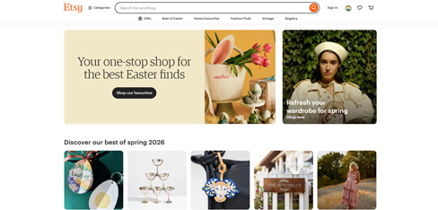
Our marketplace UI had grown organically over years and it showed — buyers were overwhelmed and sellers couldn’t differentiate their shops. UX Stalwarts delivered a full UI redesign that transformed how buyers experience Etsy on every device. The 64 percent conversion lift and 41 percent drop in mobile bounce rate were beyond what we projected. Most importantly, the new seller storefront templates gave our creative community a way to express their brand, and the 74 percent adoption rate within 60 days told us we got it right.
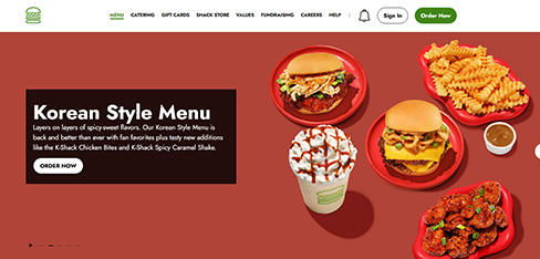
Our digital UI had fractured across three platforms with no shared design language, and it was costing us in both brand equity and engineering efficiency. UX Stalwarts built the Shake Stack design system from the ground up, and the impact was immediate. Cutting our product cycle by 40 percent meant we could expand faster. Seeing a 22 percent lift in digital average check size and a 34 percent improvement in kiosk completion rates proved that great UI design is a direct revenue driver. This is the design foundation we’ll scale globally on.
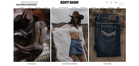
Our website looked like a generic retail catalog, not the destination our in-store customers know and love. UX Stalwarts reimagined our entire e-commerce UI around the Boot Barn lifestyle, and the numbers speak for themselves. A 48 percent revenue increase and a 63 percent conversion lift in two quarters was transformational. Dropping our return rate from 34 to 21 percent with better size guide UI alone paid back the investment. Our online store finally feels like Boot Barn.
Exploring a Partnership with a Professional User Interface Design Services Provider? These are answers to the questions asked most frequently by product leaders and procurement teams:
Begin by looking through their portfolio for visual range instead of stylistic repetition. A good UI design agency should show fluency in crossing brand personalities rather than a singular aesthetic applied to every client. Ask about their component design methodology and whether deliverables include documented design tokens and responsive specifications, not just flat screen mockups. Request references from product or engineering leads as opposed to marketing contacts, because these are the folks who experience the quality of handoff documentation first-hand. Verify whether senior user interface designers will carry out the work or simply present during the sales cycle. A reputable ui design consultancy will welcome these checks rather than gate them.
Pricing is based on the number of unique layouts for the screens, the range of responsive breakpoints, the complexity of interactive states and micro-interactions, the number of brand variations or theming layers, and whether a complete design system is included or screens are delivered individually. Mobile UI design engagements that address the conventions of both the iOS and Android platforms have a higher level of investment than single-platform projects. A credible UI design services company will break the costs down by phase of deliverables so you can assess where your budget is most commercially impactful.
A targeted visual redesign of an existing product with established interaction patterns can be done in three to five weeks. A full engagement, such as a visual audit, brand-aligned exploration, full-screen design (crossing responsive breakpoints), component library development, and developer handoff documentation, takes six to twelve weeks, depending on the number of different user flows. Timelines are compressed in cases where clients deliver finalized wireframes and interaction specs at the project kickoff, and timelines are extended where visual exploration also needs to address upstream branding gaps.
UX design is responsible for the structure, flow, and logic of a digital product. What screens are there, what actions can you take, and how do you complete your tasks? UI design dictates the appearance, feel, and visual communication of that structure: typography, color, spacing, iconography, and interactive states. Most products require both, but they are different disciplines requiring different skills. When considering user interface design companies, check to see if they have dedicated visual designers as opposed to generalists who handle both roles, because visual craft at production levels requires dedication.
Three capabilities differentiate the practice: Visual engineering discipline, where every color, type, and spacing decision is tied to a documented rationale; Multi-script and localization readiness, accounting for global product requirements from the first design sprint; and governed design-to-code handoff, to avoid the visual drift that products often experience at the end of an agency engagement. Also, 18 years of cross-sector delivery have ensured that the visual pattern library is deep enough to speed timelines without defaulting to generic templates that destroy brand distinction.
The process starts with a simple consultation call in which your visual challenges, brand context, timeframe, and budget parameters are discussed. A scoping document then follows that includes recommended phases, deliverable specifications, a range of investment, and the team assigned to your project. There is no cost for this initial consultation. Once alignment is confirmed, the engagement is underway with the visual audit phase. User interface design firms that ask for commitment without understanding your brand context are unlikely to deliver work that authentically represents your organization.
Yes. Engagements often include global brand teams with specific requirements on how color is used, logo clearspace, photography treatment, and typographic hierarchy. The output of visual design is created within those constraints and is documented in a format that ties in with existing brand management systems. For organizations that don’t have existing brand guidelines, the exploration phase can help to lay down the ground rules against which all subsequent UI designing services and product-team decisions will be made.
Support includes visual QA for development sprints, design system governance sessions as new components are required, and periodic visual audits benchmarking the live product against the approved design specification. Retainer arrangements give you continued access to senior user interface designers who have continuity with your product’s visual language. This helps eliminate the quality degradation that usually occurs when engineering teams take a design system and stretch it for additional development without visual design oversight.
The broadest portfolios are in fintech and digital banking, healthcare and clinical systems, insurance and insurtech, e-commerce and direct-to-consumer, real estate and proptech, logistics, education technology, and enterprise SaaS. Within each sector, the practice knows the specific visual conventions, data density norms, regulatory color signaling, and photography treatment standards that shape credible interface design. User interface design companies that claim to be universal without demonstrating awareness of the specific sector are likely applying generic patterns that will not communicate credibility.
A freelance user interface designer provides dedicated execution and generally has a lower hourly rate, which may make this model suitable for well-scoped work such as a visual refresh to a single feature or a marketing landing page. However, for projects that require a full design system, multi-platform responsiveness, accessibility compliance, and coordinated handoff to engineering, the multi-disciplinary team, quality assurance layers, and project governance of a UI design services agency are preferred. The deciding factor is generally scope complexity and the amount of downstream engineering support required. A specialised ui consultant suits narrow advisory work, while a ui agency suits multi-track delivery and governance.
Mobile application UI design requires adherence to platform-specific Human Interface Guidelines from Apple and Material Design conventions from Google, along with attention to touch target sizing, gesture-based navigation, safe area insets for notched and dynamic island displays, and variable network condition states affecting loading skeleton design. Web user interface design accounts for wider ranges of viewports, hover states, keyboard navigation, and multi-window usage patterns. Designing both platforms well involves understanding these differences in the interaction model down to a granular level.
Standard deliverables include a comprehensive high-fidelity screen library across all responsive breakpoints, a documented component library with variant states and usage guidelines, design token files in JSON and CSS formats, micro-interactions and motion specifications with Lottie or Rive preview files, redline annotation documents for precision developer reference, and an accessibility compliance report. All assets are in Figma with naming conventions geared towards engineering consumption.
Embedded collaboration is a basic engagement model. Senior visual designers are part of your existing workflow. They participate in sprint ceremonies, design review sessions, and maintain shared Figma environments with real-time annotation access for developers. This model works particularly well for organizations where interaction design and product strategy are done in-house, but a specialist UI design company capability is required to bring the visual layer to the next level.
As AI-enabled chatbots, virtual assistants, and embedded messaging interfaces have become the norm, the visual design of conversational flows has become a separate discipline. Conversational user interface design focuses on message bubble styling, typing indicators, quick reply chip designs, card-based rich responses, voice-plus-screen multimodal presentations, and error-state messaging, all within your brand’s visual language.
A design system takes a one-time visual design engagement and turns it into a self-sustaining, value-compounding asset. It gives engineering teams the pre-built, pre-approved components needed to cut feature-build time, eliminate inconsistency, reduce onboarding time for new hires, and build a single source of truth that ensures your mobile, web, and embedded interfaces stay visually consistent.

C – 81C, Sector – 8, Noida 201301, India


1025 Beamon Drive, Franklin 37064 Tennessee, USA
Sveavagen 34 111 34 Stockholm, Sweden
A-10, Sahastradhara Rd, Doon IT Park, Dehradun, Uttarakhand
© 2026 UX STALWARTS. All rights reserved.


