
Products fail visually long before users notice a usability issue. Color choices that conflict with accessibility standards, typography that collapses on mobile screens, component spacing that creates visual clutter, and brand elements that feel inconsistent across platforms all undermine user confidence and reduce engagement. These problems compound when teams skip the mockup stage and move directly from structural wireframes to interactive prototypes, embedding visual design decisions into complex interactive files where they become expensive to revise. Mockup design services exist to isolate and resolve every visual decision in a static, reviewable format before interaction and code enter the picture.
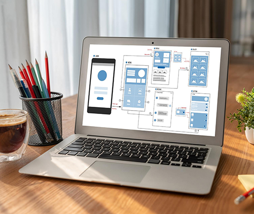
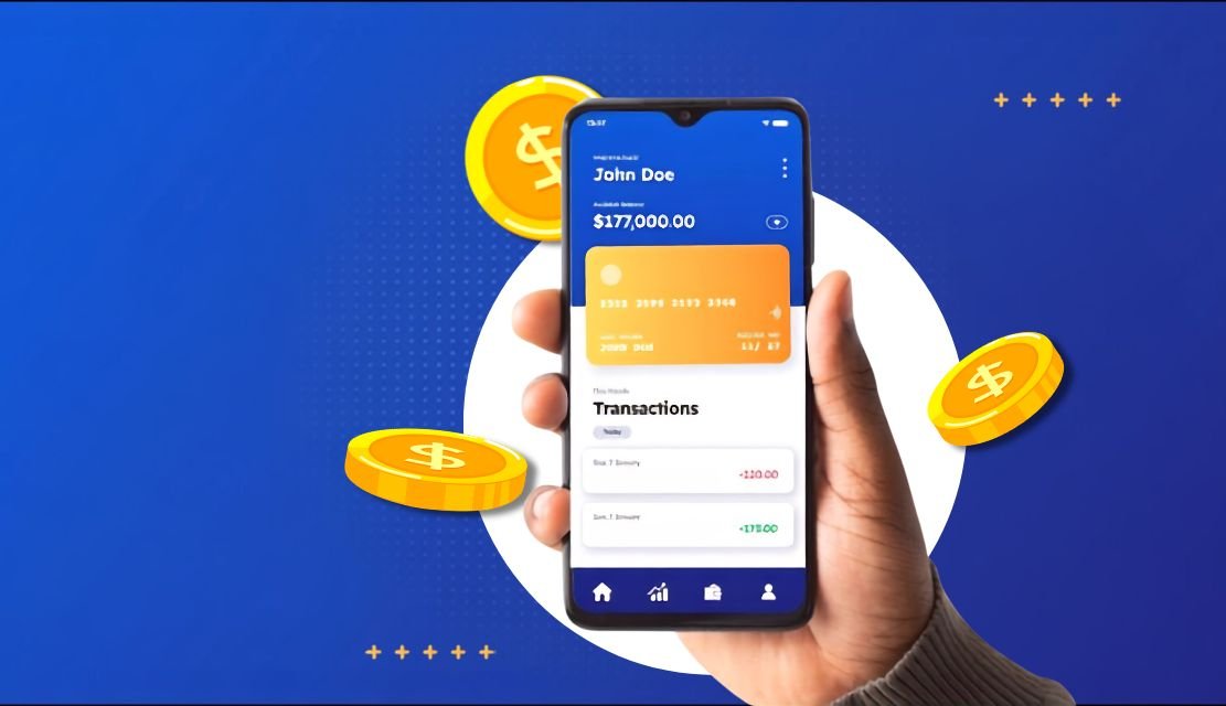
UX Stalwarts delivers mockup design services that give product teams a definitive visual reference for every screen, component, and state in their digital product. Each engagement produces high-fidelity static screens that specify typography hierarchies, color application rules, iconography systems, image treatment standards, and spacing values. UI mockup design services cover component-level styling for buttons, forms, cards, navigation bars, and data displays. Website mockup design addresses responsive visual behavior across desktop, tablet, and mobile breakpoints. Mobile app mockup designs follow platform-specific visual guidelines for iOS and Android, ensuring that visual design aligns with native rendering expectations from the start.
Eighteen years of visual design work across industries including fintech, healthcare, SaaS, e-commerce, and enterprise software have shaped a mockup practice that treats visual design as a precision discipline rather than a decorative step. Every color value, type scale, and spacing token is documented with rationale. Every component variant is designed across its full state spectrum. This level of visual rigor is what separates a mockup design agency that produces attractive screenshots from one that produces visual systems developers can implement without interpretation. The mockup designs delivered here become the single source of visual truth for entire product teams.

Every mockup design begins with documented brand guidelines, translating colors, typography, and visual identity into interface components that reinforce brand recognition across every screen. Teams working without established brand systems receive a foundational visual language created during the mockup process, ensuring consistency before development begins and across all future product updates.

Mockups include every visual state for every component: default, hover, active, disabled, error, loading, and empty. Developers receive a complete visual reference that eliminates guesswork about how buttons, inputs, dropdowns, and cards should appear under every possible condition rather than discovering missing states during implementation.

Visual design must maintain brand integrity across screen sizes without simply shrinking desktop layouts onto mobile viewports. Mockup designs specify how typography scales, how component layouts reflow, how imagery crops, and how navigation transforms at each responsive breakpoint. This prevents the visual fragmentation that occurs when responsive adaptation is left to developer interpretation alone.

Color choices in mockups are verified against WCAG contrast requirements before stakeholder review. Text on background combinations, interactive element states, and data visualization palettes are tested for accessibility compliance during the mockup phase, not as an afterthought during QA. This prevents costly color revisions after visual design has already been implemented.

The mockup process naturally produces a documented component library and style guide that scales beyond the initial project. Typography tokens, color variables, spacing scales, and component specifications are organized into a reusable design system, giving product teams a foundation for maintaining visual consistency across future features and platforms.

Mockup designs serve as stakeholder communication tools, not just developer references. Every deliverable is structured for executive review, investor presentation, and cross-functional alignment meetings. Teams receive mockups they can present confidently to leadership, board members, and external partners, demonstrating product quality and visual maturity before a single line of code exists.
Mockup design determines whether users perceive a product as polished and trustworthy or amateur and unreliable. First impressions form in milliseconds, and those impressions are driven almost entirely by visual design quality. When mockup designs are resolved before development begins, teams eliminate the most visible category of product issues: inconsistent typography, misapplied brand colors, component styling that varies across screens, and responsive layouts that break visual hierarchy. Beyond perception, resolved mockups accelerate development by giving frontend engineers unambiguous visual specifications. The best mockup design services treat visual design as a measurable quality standard rather than a subjective creative exercise.
Collaborate with visual design specialists who deliver pixel-perfect mockups.
This visual design methodology has been refined across hundreds of engagements to produce mockups that developers implement without reinterpretation.

Existing brand assets, style guides, and visual references are inventoried and assessed before any screen design begins. Gaps in the visual identity system are identified, such as missing responsive typography rules, undefined component states, or incomplete color palettes. The output is a visual readiness report that shapes all subsequent mockup decisions.

A comprehensive visual foundation is established, defining the type scale, color system, spacing grid, elevation model, and iconography style that will govern all mockup screens. These foundational tokens are documented with usage rules and accessibility verification. Teams that lack established brand systems receive a complete visual language built during this phase.

Every UI component is designed across its full state spectrum: buttons, form inputs, cards, navigation elements, modals, tooltips, alerts, and data display patterns. Each component receives default, hover, active, focus, disabled, error, and loading state treatments. This comprehensive component library becomes the building vocabulary for all screen-level mockup compositions.

Individual screens are composed using the established component library and visual foundation. Each screen specifies content placement, visual hierarchy, imagery treatment, and typographic relationships at full fidelity. Website design mockup deliverables cover responsive breakpoints for desktop, tablet, and mobile. App mockup screens address platform-specific visual conventions for iOS and Android independently.

Completed mockup designs are presented to stakeholders through structured review sessions focused on visual consistency, brand alignment, accessibility compliance, and platform appropriateness. Feedback is collected against defined criteria rather than open-ended aesthetic opinion. This structured review process prevents subjective drift and keeps visual refinements focused on measurable quality standards.

Approved mockups are packaged with complete design specifications for development teams. Every color value, spacing measurement, typography setting, and component state is documented in developer-friendly inspection formats. The deliverable includes organized source files, an exported design system, and responsive behavior notes that enable accurate frontend implementation.
Explore how mockup design services have shaped visual product outcomes across 1,000+ client engagements spanning healthcare, fintech, SaaS, and retail.
Visual design standards differ dramatically between a consumer lifestyle app and a clinical data management platform. This practice operates on that understanding. Every mockup engagement applies industry-specific visual conventions, compliance display requirements, and audience expectations for visual sophistication. From startups refining their first ui ux design mockup to enterprises standardizing visual systems across product portfolios, the visual design methodology scales without sacrificing the precision that production-quality mockups demand.
Industry-specific mockup experience spans healthcare patient portals, fintech trading dashboards, e-commerce product galleries, SaaS onboarding interfaces, EdTech learning platforms, logistics tracking panels, insurance claims portals, and media content management systems. Each vertical introduces unique visual requirements around data density, regulatory content display, and brand differentiation within competitive markets. That accumulated visual pattern knowledge means mockup designs produced here reflect proven industry conventions from day one.


Most mockup design services produce attractive screen renders. This practice produces visual decision systems. Every mockup is built as a documented, rationale-backed visual specification that developers can implement precisely and product teams can extend consistently. That discipline has earned partnerships with organizations that treat visual design as a measurable component of product quality.
Rationale-Documented Visual Decisions: Every color choice, type scale, and spacing value includes documented reasoning, making visual design decisions defensible during stakeholder and developer review.
Full-State Component Coverage: Components are designed across every interaction state, eliminating developer guesswork and preventing the visual inconsistencies that surface when states are improvised during code.
Design System as Standard Output: Every mockup engagement produces a reusable design system, giving product teams a scalable visual foundation that extends beyond the initial project.
Delivering the best mockup design services requires tools that support precision component design, real-time team collaboration, and seamless developer handoff. These platforms power every engagement.


Visa needed $450 million in commitments to launch next-generation payment platform but had no working product to show investors and partners. UX Stalwarts created pixel-perfect mockups that told compelling story. Securing full funding and unanimous partner approval proved mockups are not optional for high-stakes pitches — they are essential. The detailed scenarios and edge cases demonstrated design thoroughness that built stakeholder confidence. This mockup work made our vision tangible and investable.
Mastercard digital wallet had 40+ stakeholders with completely different expectations creating development paralysis. UX Stalwarts created comprehensive mockups that established shared vision. Increasing alignment 340 percent and reducing rework 67 percent proved showing beats telling. Teams that debated requirements for months achieved consensus in single mockup review session. This visual communication transformed how we approach complex multi-stakeholder product development.
American Express previous app launch cost $8.7 million in post-launch fixes because usability issues were discovered too late. UX Stalwarts created comprehensive mockups enabling early testing. Reducing issues 78 percent and post-launch costs from $8.7 to $1.9 million proved mockup investment prevents expensive mistakes. Customer satisfaction improving from 7.4 to 9.1 showed premium mockup quality delivered premium experience. This mockup-first approach became standard for American Express digital products.
Evaluating mockup design partners and need clarity before committing to a project?
Mockup design services produce high-fidelity static visual representations of digital product screens. Unlike wireframes, which define structural layout using simplified shapes and placeholders, mockups apply the full visual treatment including typography, colors, iconography, imagery, and component styling. Unlike prototypes, which add interactive behavior and clickable navigation, mockups focus exclusively on visual appearance and brand expression. Mockups answer the question “how will the product look?” while wireframes answer “where does content go?” and prototypes answer “how does the user interact with it?” This three-stage separation keeps visual decisions isolated from structural and behavioral complexity.
Look for a mockup design agency among the top mockup design agencies, that treats visual design as a system rather than a collection of individual screens. Ask whether they document visual decisions with rationale, design components across all interaction states, and deliver organized design system files alongside finished screens. Check whether they address responsive visual behavior across breakpoints rather than designing only for desktop. Confirm they verify color accessibility against WCAG standards during the mockup phase. Finally, review their experience with your platform type, since website mockup design and mobile app mockup design require different visual convention knowledge that a capable ux design mockup agency can demonstrate.
A ui design mockup focuses on the visual presentation of interface elements: button styles, color application, the ui design mockup discipline emphasizing, typography choices, iconography, card layouts, and form field aesthetics. It addresses how the product looks. A ux design mockup focuses on how visual design supports usability: whether visual hierarchy guides user attention correctly, whether calls to action are visually prominent, and whether information groupings are communicated through visual relationships. The best mockup design services integrate both perspectives, delivering a unified ui ux design mockup approach, ensuring that visual beauty and user comprehension work together rather than competing. This integrated approach produces brand-aligned interfaces that also perform measurably well.
Mockup design costs, shaped by mockup designs consulting services scoping, depend on the number of unique screens, component complexity, number of responsive breakpoints, and whether a design system deliverable is included. A focused project covering 10 to 15 screens for a single platform costs significantly less than designing a comprehensive visual system across web, iOS, and Android with full component state coverage. Affordable mockup design services are available for startups with focused screen counts, while enterprise engagements scale to cover large-scale product visual systems through tailored mockup designs solutions. The most transparent pricing comes from agencies that scope based on screen count and component inventory rather than open-ended hourly estimates.
Timeline varies with scope and complexity. Seasoned website design mockup experts plan around realistic delivery milestones. A focused website design mockup project covering 10 to 15 unique screens typically takes two to three weeks, including style foundation setup and one round of visual review. Comprehensive mockup projects spanning multiple platforms with 30 or more screens and full design system delivery take four to eight weeks, a range commonly quoted by top mockup design agencies. The primary timeline variable is visual review speed, since prompt stakeholder feedback keeps projects moving without idle gaps. Projects that include 3D mockup design services for product visualization may add one to two weeks depending on rendering complexity.
Standard deliverables from UI mockup design services include high-fidelity screen designs organized by user flow and platform, a complete component library with all interaction states documented, a typography and color specification guide, responsive breakpoint references showing visual adaptation across screen sizes, and organized source files in Figma, Sketch, or the agreed tool format. Higher-scope engagements include a fully documented design system with token definitions, component usage guidelines, and accessibility compliance verification, producing end-to-end mockup designs solutions. 3D mockup design services add product visualization renders for marketing and pitch materials. All deliverables are structured for both stakeholder presentation and direct developer reference.
Yes. Website mockup design covers, as delivered by a specialist website mockup design company, visual design across desktop, tablet, and mobile breakpoints with explicit documentation of how typography scales, how component layouts reflow, and how navigation transforms at each viewport. Rather than designing one breakpoint and expecting developers to interpolate the rest, each critical breakpoint receives a dedicated mockup screen, a discipline website design mockup experts maintain rigorously. This prevents the visual fragmentation that occurs when responsive adaptation is left entirely to frontend interpretation. Responsive mockup designs also document image cropping behavior, content reordering logic, and whitespace management rules that maintain visual hierarchy across all device categories.
Yes. 3D mockup design services produce photorealistic product visualization renders that showcase digital interfaces displayed on physical devices, packaging, and environmental contexts. These renders are used in investor pitch decks, marketing materials, app store listings, and client presentations where contextual realism enhances perceived product quality. 3D mockup designs include device mockups showing interfaces on phones, tablets, laptops, and desktop monitors, as well as environmental mockups placing digital products in realistic usage scenarios. The output formats support both digital presentation and print-quality marketing collateral production.
Mockup design experience spans healthcare, fintech, e-commerce, SaaS, EdTech, logistics, real estate, insurance, media, and government platforms. Each industry introduces distinct visual requirements, which mockup designs consulting services translate into clear visual rules. Healthcare mockups require calming color palettes and clear data presentation for patient-facing interfaces. Fintech mockups demand precision typography for numerical displays and trust-building visual hierarchies. E-commerce mockups focus on product photography integration and conversion-optimized visual layouts. SaaS mockups address data-dense dashboard styling and onboarding sequence visual flow. This cross-industry visual pattern knowledge informs every mockup engagement from the initial style foundation phase.
Mockup designs serve as the visual blueprint for frontend implementation. Developers receive organized source files with every color value, spacing measurement, typography setting, elevation value, and component state documented in inspection-ready formats through tools like Zeplin or Figma’s developer mode. This eliminates the interpretation gap that causes visual inconsistencies between approved designs and built products. Post-handoff support ensures mockup intent carries through implementation, with questions about visual behavior, component state rendering, and responsive adaptation addressed promptly during build sprints. The accessibility compliance built into mockups also carries directly into development testing.
A mockup design services company based in India, or a focused website mockup design company, offers deep visual design talent, cost efficiency, and working hour overlap that supports global product teams effectively. India has one of the largest trained UI/UX professional communities working across international engagement models, positioning the country among the top mockup design agencies globally. Teams deliver mockup projects at price points that allow both startups and enterprises to invest in thorough visual design without exceeding budget constraints. Overlap with US, European, and Australian business hours enables real-time collaboration during critical visual review cycles. The key differentiator is combining affordable mockup design services with enterprise-grade visual precision.
Yes, and combining them is often the most efficient approach. When mockup design feeds directly into interactive prototyping within the same engagement, visual decisions carry through into behavioral testing without the handoff friction that occurs when separate teams handle each phase. The mockup phase resolves all visual questions, and the prototyping phase adds interaction and navigation to those resolved visuals. This combined approach eliminates redundant review cycles and ensures visual quality is maintained through every stage of the design-to-testing pipeline, from static screen approval through interactive usability validation.
A high-fidelity mockup is a static screen design that closely resembles the final product in visual detail, including exact typography, colors, imagery, iconography, component styling, and spacing. It is necessary when stakeholders need to approve the final visual direction before development begins, when developers need unambiguous visual specifications to implement, or when marketing teams need product visuals for launch materials before the product is built. High-fidelity mockup designs are the standard deliverable for most client-facing and enterprise projects from a specialist ux design mockup agency, while lower-fidelity visual explorations may be used during early concept phases before the visual direction is confirmed.
Brand consistency is enforced through a documented style foundation created at the beginning of every engagement. This foundation defines color tokens with hex values and usage rules, typography scales with platform-specific font stacks, spacing grids, elevation models, and iconography standards. Every screen is composed using this shared foundation, ensuring visual consistency is systemic rather than dependent on individual designer memory. Review cycles include brand alignment verification alongside visual quality assessment. The resulting design system continues to enforce brand consistency long after the mockup engagement concludes, providing a durable visual framework for ongoing product development.
The best mockup design services, the kind associated with leading mockup designs services firms, deliver visual systems, not just attractive screen images. They document every visual decision with rationale, design every component across its full state spectrum, verify accessibility before stakeholder review, and produce organized design system files that developers can implement precisely and product teams can extend independently. Average providers deliver static screens, unlike disciplined mockup designs services firms, without state coverage, accessibility verification, or design system output, leaving teams to resolve visual gaps during development. The performance impact of visual quality on conversion and retention makes this distinction a measurable business difference, not merely an aesthetic preference.

C – 81C, Sector – 8, Noida 201301, India


1025 Beamon Drive, Franklin 37064 Tennessee, USA
Sveavagen 34 111 34 Stockholm, Sweden
A-10, Sahastradhara Rd, Doon IT Park, Dehradun, Uttarakhand
© 2026 UX STALWARTS. All rights reserved.


