
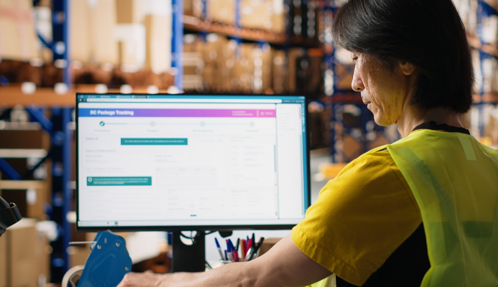
Fleet managers spend their days juggling driver schedules, fuel costs, delivery exceptions, and compliance paperwork. The software meant to help them often adds friction instead. Poorly designed freight platforms force managers to click through five screens to answer one question. Good UX turns the same tool into a command center. For logistics businesses competing on speed and reliability, user experience is no longer a cosmetic concern. It is an operational lever. This blog explains how to design freight and logistics platforms that work the way fleet managers actually think, decide, and respond.
A fleet manager is not a casual software user. They are an operations lead making dozens of decisions per hour, often under real time pressure. Their platform must surface the right information at the right moment, without ceremony or clutter.
Generic enterprise interfaces treat every data point as equally important. Fleet operations do not work that way. A late delivery, a driver on hours of service violation, or a vehicle with a diagnostic alert should pull attention immediately. Routine stops should recede. Good UX enforces this hierarchy. According to McKinsey research on logistics digitization, companies that invest in operator centric digital tools consistently outperform peers on service reliability and cost efficiency.
Most fleet platforms were built feature first, not user first. The result is familiar to anyone who has sat with a dispatcher during a live shift:
These are not minor inconveniences. They compound across a shift and erode decision quality. A well designed logistics platform solves these by treating the fleet manager’s workflow, not the database schema, as the organizing principle.
The home screen should answer three questions before any click. What needs my attention right now? What is already on track? What is coming up next? Everything else lives one level deeper. Visual weight, color, and position must reflect urgency, not alphabetical order or feature parity across modules.
Live tracking is table stakes, but a map littered with icons is useless. Progressive disclosure works better. Show the fleet at a glance, let the manager zoom into an exception, and surface context such as driver, cargo, ETA, and customer in a side panel without a page reload. Harvard Business Review coverage of operations management has consistently reinforced that decision latency, not data volume, is the real bottleneck for operators under pressure.
Fleet managers do not think in modules. They think in tasks: assign a driver, reroute a load, approve an expense, pull a compliance report. Navigation should map to these tasks. A sidebar labeled Dispatch, Compliance, Maintenance, and Billing is more honest than one labeled Vehicles, Users, and Settings.
A dashboard is not a report. It is a decision surface. When designing one for fleet managers, lead with status, then exceptions, then trends. Reserve granular detail for drill downs.
Patterns that consistently work in freight dashboards include:
Dashboards that follow these patterns reduce the number of tabs a manager keeps open and the number of calls they make to confirm what the screen is already telling them.
Fleet managers are rarely at a desk all day. Yard walks, driver check ins, and client visits mean the platform must work on a phone with the same confidence it works on a wide monitor. This is not about shrinking the desktop view. It means re-designing the critical paths for mobile first: approving a dispatch, acknowledging an alert, calling a driver, and checking a load status with one hand.
Offline tolerance matters just as much. In warehouses, ports, and rural routes, connectivity is uneven at best. Interfaces that queue actions locally and sync when the connection returns outperform those that error out and lose the user’s work.
A few patterns show up in platform after platform, and all of them are avoidable with the right design process:
Each of these quietly reduces adoption and drives shadow systems such as spreadsheets, group chats, and printed sheets that defeat the platform’s purpose.
With close to two decades of experience across transportation, supply chain, and enterprise software, our team designs logistics interfaces that fleet managers actually want to open. We start with field research by shadowing dispatchers, interviewing drivers, and mapping decision flows during live shifts. We then prototype against those flows, test with real operators, and iterate before a single production line of code is written. Our UX design services are built around this discovery first approach. Our enterprise UX consulting work has delivered platforms used by logistics, fintech, healthcare, and retail teams across India, the US, and Europe. If you are rebuilding a transportation management system, scaling a last mile product, or launching a freight marketplace, our product design practice can help you move from a feature list to an interface your operators defend.
If your logistics software is slowing operations instead of accelerating them, we should talk. Our team can audit your current platform, benchmark it against operator needs, and chart a redesign path that fits your business goals. Reach out to UX Stalwarts to start a conversation about freight and logistics UX that delivers measurable results.
It is the practice of designing software interfaces that reflect how fleet managers, dispatchers, and drivers actually work. It covers dashboards, workflows, mobile apps, and reporting, with the goal of reducing decision time and operational errors across daily shifts.
Clear interfaces lower training time, cut the number of support calls, reduce missed exceptions, and help managers act on issues before they escalate. Over a quarter, these gains compound into meaningful improvements in on time delivery, asset utilization, and driver retention.
Common triggers include falling user adoption, rising support tickets, a planned platform migration, or expansion into new regions and vehicle types. If managers rely on spreadsheets to do work the platform should handle, a redesign is already overdue.
Yes. Logistics interfaces must handle real time data, geographic context, strict compliance workflows, and operators who split their time between desk and field. Standard enterprise UX patterns often ignore these operating conditions and the trade offs they create.
Through responsive design that re-architects critical paths for mobile, offline tolerant workflows, role based views, and task driven navigation. The same underlying data should serve different interfaces, each shaped around the user’s physical context and immediate decisions.
A structured discovery phase that includes operator interviews, workflow mapping, and an audit of the current interface against observed behavior. This produces a prioritized backlog grounded in real use, not internal assumptions.

C – 81C, Sector – 8, Noida 201301, India


1025 Beamon Drive, Franklin 37064 Tennessee, USA
Sveavagen 34 111 34 Stockholm, Sweden
A-10, Sahastradhara Rd, Doon IT Park, Dehradun, Uttarakhand

© 2026 UX STALWARTS. All rights reserved.

