
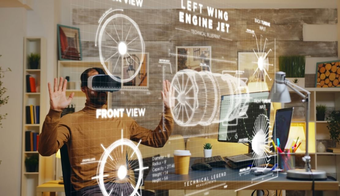
Augmented reality has moved past the novelty stage. Retailers use it to help shoppers preview furniture in their living rooms. Surgeons use it to overlay imaging on a patient during a procedure. Field technicians use it to see schematics on the machine in front of them. Educators use it to make abstract concepts tangible for students. What separates a useful AR product from a forgettable one is rarely the graphics engine or the hardware brand. It is the thinking behind the interaction. This guide walks through the UX principles that make AR feel intuitive rather than intrusive, along with the mistakes teams repeat when they treat headsets and phones as flat screens with extra layers on top.
Two dimensional interfaces sit inside a frame. The user controls what enters the frame and what leaves it. AR does the opposite. The interface enters the user’s world. Lighting changes across the day. Objects move. Bystanders enter and exit the scene. Attention shifts constantly between the physical environment and the digital overlay. A menu that works cleanly on a mobile app can become disorienting or unsafe when rendered in three dimensions across a busy environment such as a workshop or a hospital ward.
That shift changes the job of the designer. You are no longer arranging pixels on a fixed canvas. You are placing information into a space the user already occupies, and that space has physics, other people, and real consequences for attention and safety. Good ar ux design treats the physical world as the primary layer and the digital content as a respectful guest that earns its place on the screen.
Floating panels that follow the head or camera feel synthetic and add motion sickness risk over long sessions. Whenever possible, attach digital elements to a fixed spatial anchor, such as a table, a wall, a printed marker, or a recognized object. Users can then look away, walk around the room, and return without losing their place in the task. Nielsen Norman Group research on spatial UI reinforces that world locked content is easier to understand and remember than head locked overlays.
Users in AR are still in the physical world. They can trip, bump into a colleague, or miss a car. Keep the central field of view clear of dense content. Fade or dim overlays when the system detects fast motion. On phones, remind users to look up. On headsets, use passthrough boundaries that reveal the room when a user leaves a safe zone. The World Health Organization has already flagged distracted walking as a growing injury source, and AR is a new contributor to that pattern.
Every gesture, gaze, or voice command should be easy to learn, easy to repeat, and easy to undo. Complex hand gestures fail in low light, cold weather, or noisy public spaces. Offer at least two ways to trigger any important action, and confirm destructive actions with a lightweight preview rather than a modal alert.
The user is already processing the room around them. Add too many labels, arrows, and popups, and comprehension drops sharply. Use size, opacity, and depth to signal what matters. Show one primary object at a time. Progressive disclosure works better than dense dashboards, especially on smaller headset displays.
Raising an arm to tap a virtual button in front of your face gets tiring within seconds. This is called gorilla arm, and it has been documented in interaction research for over a decade. Place frequent controls near the waist or within a relaxed field of view. Support seated and standing use. Design for short sessions on handheld AR and longer sessions on headsets, but never assume the user will hold a fixed pose. Weight, balance, and heat build up on the device also shape how long a session stays comfortable, and the interface should adapt to those limits rather than fight them.
AR often relies on vision, hearing, precise gestures, and steady hands. That excludes a large share of potential users unless you plan for inclusion from the start. Provide captions for audio cues. Offer high contrast modes. Allow larger anchor targets. Support alternate inputs such as voice, controller, or dwell selection. The Web Content Accessibility Guidelines published by W3C give a starting point that carries over well into three dimensional interfaces.
AR apps ask for camera access, location, motion sensors, and often microphone access on first launch. Explain each request in plain language, in context, at the moment the feature is needed. A single permissions wall on day one causes drop off. Short guided prompts embedded in the first real use case earn trust and better completion rates.
When a user places, resizes, or removes a virtual object, they need instant confirmation. Sound, haptics, and a brief visual pulse work well together, and each channel serves users whose attention or ability may vary. Silence after an action leaves the user unsure whether the system saw the input, which quickly erodes trust. Consistency across sessions also matters. If a pinch resizes a chair today, it should not rotate a lamp tomorrow.
Tracking will drop. Lighting will confuse the sensor. The network will lag at exactly the wrong moment. Your ar interface design should assume these failures and recover without blaming the user. Show a calm message, keep the last known state visible on screen, and offer a clear next step. Avoid full screen error overlays that break immersion and force a restart of the whole session.
AR devices capture the user’s environment, including bystanders who never opted in. That responsibility sits on the designer as much as the engineer. Limit background recording. Show a clear, always visible indicator when the camera is active. Store spatial maps locally where possible, and delete them on a predictable schedule. Explain data use in short, honest language during onboarding and again in settings, so users can revisit their choices later.
Even experienced product teams stumble when they move into spatial computing for the first time. A few patterns show up again and again in reviews and post launch retrospectives.
The first is porting a mobile app into three dimensions with almost no rethinking. Tabs, sliders, and modal dialogs rarely translate cleanly. They compete with the world instead of extending it, and users treat them as clutter rather than as tools.
The second is designing for the demo rather than the daily use case. A ten second showroom moment is not the same as a nurse using AR guidance across an eight hour shift. Fatigue, occlusion, interruptions, and shift handovers decide whether the product survives past the pilot phase.
The third is skipping real environment testing. A staged office with perfect lighting hides the tracking issues that appear in a warehouse, a hospital corridor, or a sunny outdoor site. Structured UX research in the actual use environment prevents expensive rework and protects the launch timeline.
The fourth is over relying on flashy animations. Motion should communicate cause and effect, not entertain. Excess movement raises motion sickness risk and drains battery, both of which shorten the session and the review score.
AR investments only pay off when users adopt the product without heavy training. Clear, disciplined UX reduces the support load, shortens onboarding time, and raises task completion rates across the user base. In enterprise settings such as manufacturing and healthcare, that translates into fewer errors, faster procedures, and measurable savings on training hours. In consumer settings such as retail and real estate, it translates into higher engagement, longer session times, and better conversion at the point of decision.
Deloitte’s ongoing work on immersive technology in the enterprise points to the same conclusion. Adoption stalls when the interface feels unfamiliar or heavy and accelerates when it feels obvious. UX is the deciding variable, not the hardware brand or the resolution of the display. Teams that budget for research, iteration, and field testing consistently ship AR products that outlast the first pilot and earn a place in the day to day workflow.
Strong AR products come from teams that treat design as a spatial discipline from day one. That means user research in the actual environment, prototypes tested on real devices with real users, and clear governance of accessibility, safety, and privacy across every release cycle. It also means resisting the pull to copy screens from an existing web or mobile product into a spatial layer without rethinking the interaction. If you are exploring AR for your business, a short discovery session with our team can surface the specific decisions that will shape your first release and reduce the cost of learning the hard way.

C – 81C, Sector – 8, Noida 201301, India


1025 Beamon Drive, Franklin 37064 Tennessee, USA
Sveavagen 34 111 34 Stockholm, Sweden
A-10, Sahastradhara Rd, Doon IT Park, Dehradun, Uttarakhand

© 2026 UX STALWARTS. All rights reserved.

