
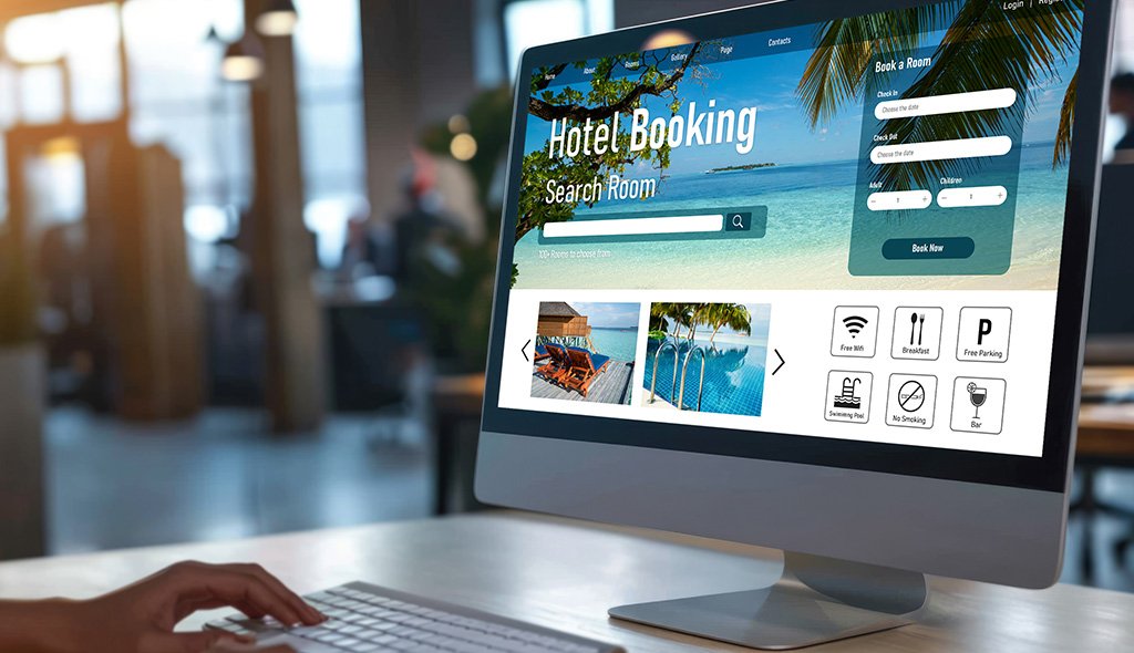
Every booking an OTA takes, your hotel pays for twice. First through commission, then through the loss of a direct relationship with a guest who could have booked on your site. For hoteliers watching margins compress while third party channels keep growing, the booking engine on your own website is the single most important recovery lever you own. Yet most hotel booking engines leak revenue at nearly every step of the funnel. Guests arrive ready to book, then abandon over clumsy calendars, confusing rate codes, slow pages, and forms that ask for too much too soon. This guide breaks down the UX fixes that actually recover direct bookings and the tactics that turn your website into your highest performing channel.
Direct bookings carry stronger margins, cleaner guest data, and deeper loyalty value than any OTA transaction. Industry coverage from Skift consistently points out that the gap between OTA economics and direct economics continues to widen as commission structures and ancillary fees evolve. Yet many hotel websites still behave like digital brochures rather than conversion products. The booking widget sits as an afterthought, often iframed in from a third party vendor, with an interface that has not been seriously updated in years.
A booking engine that feels slower, less friendly, or less transparent than Booking.com or Expedia will lose even the guests who arrived with the intent to book direct. The brand site becomes a stepping stone to the OTA app. For any hospitality brand serious about revenue management, treating your booking engine as a product rather than a utility changes the economics of the channel entirely.
Before fixing anything, map where guests actually drop off. Across most hotel websites, abandonment clusters around a predictable set of friction points that compound each other.
Each is a UX problem with a UX fix, and most hotels carry four or five of them at once. Resolving even half can recover a meaningful share of lost sessions. A structured hospitality UX audit is often the fastest way to see where your funnel is leaking.
Think of these as the recovery playbook. None of them require ripping out your reservation system.
The search bar is the first promise your website makes. Keep it visible, keep it fast, and keep it honest. Show real time availability without a page reload. Preserve the guest’s search context across pages so returning does not reset the entire flow. If a date is unavailable, suggest the nearest open dates in a similar price band rather than offering a dead end.
Guests do not read rate names, they scan them. Replace internal jargon like “BAR NRF” with human language such as “Pay now, save ten percent, non refundable” or “Pay at hotel, free cancellation until arrival”. A side by side comparison between flexible and advance purchase removes the single most common source of hesitation and reduces perceived risk.
Nothing damages trust faster than a jumping price. Display the full stay total, including taxes and fees, from the first results screen. Guidance from Google’s Think with Google travel research hub consistently highlights price transparency as a core driver of booking confidence across hospitality.
Room selection is where emotional and rational buying meet. Use short, labelled galleries showing the bed, the view, the bathroom, and one lifestyle shot. Add a one line summary of what makes each room different. Allow guests to compare two room types without leaving the page or losing their dates.
Ask only for what you need to confirm the stay. Autofill country codes, split name fields intelligently, and keep payment on a single screen. On mobile, use native numeric and email keyboards. A clean mobile first UX design on checkout typically unlocks the single largest conversion lift any hotel website can achieve in a quarter.
The confirmation page is often treated as a receipt. It should feel like a welcome. Include a clear itinerary summary, a one tap add to calendar, a direct line to the hotel for special requests, and a quiet introduction to pre arrival services. This is where you replace the OTA habit with your own brand habit.
Not every guest finishes in one session. The real question is whether your booking engine helps them come back on their own terms or quietly hands them to an OTA retargeting ad.
Each tactic works because it respects the guest’s intent instead of interrupting it with pressure.
A booking engine that takes more than a few seconds to respond on mobile loses guests silently. Google’s Core Web Vitals guidelines are a useful technical baseline for the kind of experience your engine should deliver. Measure them specifically on the booking funnel, not just the marketing pages, because the two often behave very differently.
On the trust side, visible security badges, plain language cancellation policies, verified guest reviews surfaced on the booking page, and local currency display all reduce hesitation. Direct booking guarantees, best rate promises, and small perks like early check in requests only move the needle when they appear before the guest commits, not after.
Many hotels find that rebuilding the booking engine shell around the existing central reservation system, rather than replacing the engine itself, delivers most of the conversion gain at a fraction of the cost. Our website redesign services team sees this pattern across both independent properties and chains.
Direct booking recovery is a numbers discipline, not a one off redesign. Track the look to book ratio, step by step funnel completion rates, time to first availability result, and the share of bookings arriving from returning sessions versus first time visitors. Compare your mobile and desktop conversion rates honestly, because the gap is usually larger than teams expect. Benchmark your funnel against your own OTA conversion where you can see it, since the OTA experience is the real competition for your guest’s attention. A quarterly review of these signals, paired with session recordings and heatmaps, is enough to keep the UX honest and the recovery compounding.
Hotels do not lose direct bookings because guests secretly prefer OTAs. They lose them because the OTA experience is faster, calmer, and more transparent than their own website. Closing that gap is not a one time redesign project, it is an ongoing UX discipline that pays back every month it runs. Start with the three or four friction points your data flags loudest, measure the recovery, and reinvest the savings into the next layer of the experience. Done well, your booking engine quietly becomes the highest performing sales team you have ever had.
If you want a focused review of your current funnel, talk to our hospitality UX team about a booking engine audit.
Hotel booking engine UX is the design and interaction quality of the booking widget, search flow, room selection, and checkout on a hotel’s own website. Good booking engine UX removes friction between a guest’s intent to stay and the moment they confirm the reservation. It covers calendar behaviour, rate clarity, pricing transparency, mobile responsiveness, and payment flow.
Most direct booking losses are not caused by price. They are caused by slow pages, unclear rate names, hidden fees that only appear at checkout, and mobile experiences that break under real use. OTAs invest heavily in these details, and most hotel sites do not. When the brand site feels harder to use than the OTA app, guests default to the easier option.
The highest impact recovery tactics are transparent total pricing from the first screen, a mobile first checkout, saved search links that let guests resume where they left off, and a short, personal abandoned booking email that includes the exact room and dates the guest chose. SMS recovery and specific retargeting ads add further lift when consent is in place.
Not always. Many hotels get strong results by keeping their existing central reservation system and redesigning the UX shell around it. The right decision depends on API flexibility, PMS integration depth, and the gap between current and target conversion. A UX audit usually clarifies whether a shell redesign or a full engine replacement is the better path.
Clean fixes to pricing transparency, mobile checkout, and rate clarity usually show measurable lift within the first full booking cycle. Larger structural work on the engine itself takes longer but compounds over time as trust and repeat direct bookings grow.
A large share of travel research now happens on mobile, so a booking engine that is slow, cramped, or hard to tap pushes guests back to OTA apps that have mastered mobile. Mobile first design, with large tap targets, native keyboards, and a single screen checkout, is now the baseline for direct booking recovery, not an upgrade.

C – 81C, Sector – 8, Noida 201301, India


1025 Beamon Drive, Franklin 37064 Tennessee, USA
Sveavagen 34 111 34 Stockholm, Sweden
A-10, Sahastradhara Rd, Doon IT Park, Dehradun, Uttarakhand

© 2026 UX STALWARTS. All rights reserved.

