
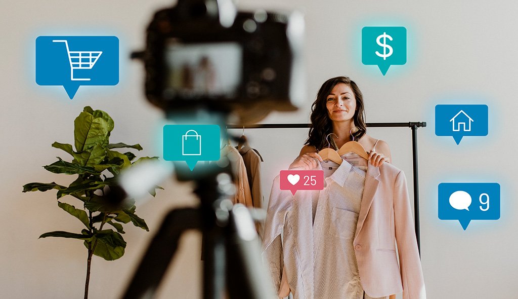
Live commerce has moved beyond its China-first origins into a mainstream retail channel across North America, Europe, and the GCC. Shoppers now expect to watch, chat, and buy inside a single video stream. For retailers, the opportunity is clear. The design challenge is harder. Poor UX turns a live stream into noise. A thoughtful interface turns passive viewers into buyers in under a minute. This guide walks product leaders, design heads, and ecommerce teams through the UX decisions that make shoppable video actually work. You will learn the structural principles, the friction points to remove, and the metrics that prove impact for your business.
Live commerce blends real time video, host led storytelling, and one tap purchasing inside a single screen. A fashion brand demos a jacket. A viewer taps the product pin. The size selector slides up. Checkout confirms. The entire path takes under thirty seconds when the UX is right.
The format first scaled in China through platforms like Taobao Live and Douyin. According to a Harvard Business Review analysis of China’s social commerce model, live shopping compresses discovery, trust building, and transaction into one continuous experience, which is why interface decisions carry disproportionate weight. Western and Middle Eastern markets are catching up fast through TikTok Shop, Instagram Live, YouTube Shopping, and brand owned apps. For your business, this means two things. The channel is real. The design standard has already been set by platforms your customers use daily.
Every successful live commerce experience we have shaped shares five design fundamentals.
These principles sound obvious. In practice, most live commerce interfaces violate at least two of them within the first thirty seconds of a stream.
The video should occupy seventy to eighty percent of the vertical screen on mobile. Product carousels sit at the bottom edge, swipeable but non intrusive. Hosts appear in a center frame, with lighting and composition that reads clearly on small screens. Vertical video is the default. Repurposed horizontal footage almost always underperforms because it was shot for a different attention pattern.
Pin product cards to the exact moments they appear on screen. Keep card content minimal: image, price, one line title, and a single primary action. When the shopper taps, slide a bottom sheet with size, color, and quantity. Avoid full page redirects. A McKinsey analysis of live commerce in Asia identifies one tap purchase paths as a decisive driver of conversion lift once viewers are already engaged.
Micro interactions matter here. A soft haptic buzz on tap, a subtle scale animation on the add to cart button, and a one line confirmation banner keep the shopper oriented without pulling attention from the host.
Chat is both entertainment and validation. Design the chat column to float, fade, and never block the product. Floating hearts, viewer counters, and pinned purchase notifications (“Priya from Dubai just bought this”) create the herd signal that converts hesitant buyers. Moderation tools must be built in from day one so hosts and producers can pin genuine questions and hide spam without breaking stride.
The biggest UX mistake brands make is forcing a full checkout page. Keep the stream playing in a minimized window during payment. Pre fill the address field, offer wallet payments like Apple Pay, Google Pay, UPI, or Mada depending on the region. A persistent “keep watching” cue reassures the buyer they are not missing the next product reveal.
Post purchase, slide a short confirmation card over the stream, then return focus to the host within three seconds. The goal is a buy that feels like part of the show, not an interruption.
We audit live commerce flows across retail, beauty, and consumer electronics, and the same errors repeat.
Avoiding these is less about adding features and more about removing anything that competes with the stream and the sale.
Live commerce UX decisions do not sit in a vacuum. The interface must integrate with inventory, payments, CDN delivery, and customer support in real time. Our ecommerce UX design services team works with engineering from day one on:
Brands scaling across regions also need to plan for regulatory variation in payments, data residency, and consumer protection. Our teams supporting clients across India, Saudi Arabia, the United States, and Sweden design these variations into the same core interface so your product does not fragment.
Vanity metrics like viewer count mislead. The numbers that reflect UX quality are:
A Deloitte review of digital commerce performance highlights that the strongest UX wins come from reducing drop off between discovery and payment, not from adding features. If your live commerce dashboard tracks only revenue and viewers, you are missing where the UX actually breaks.
Live commerce sits at the intersection of video production, ecommerce engineering, and consumer psychology. Generic teams design screens. Specialist teams design behavior under live conditions, which include buyer impulse, host rhythm, and infrastructure constraints. UX Stalwarts has shaped shoppable experiences for retail, fashion, and D2C brands across India, the United States, and Europe for over eighteen years. Our teams in Noida, Tennessee, and Stockholm partner with clients on everything from live commerce prototypes to full stack UX design services for enterprise rollouts. We bring research teams, interaction designers, and front end engineers into the same room so decisions about chat latency, pin behavior, and checkout flow are made with real constraints in view.
If you are evaluating live commerce as a channel, begin with a focused UX discovery before any platform selection. Map your audience behavior, pick two or three product categories that benefit most from demonstration, and prototype the full flow from pin to post purchase. A short pilot stream with instrumented UX gives you more decision ready data than months of competitor analysis. For teams scaling an existing live program, a focused UX audit usually surfaces three or four friction points worth fixing before adding features. The right partner reduces risk, shortens time to launch, and turns live commerce from a marketing experiment into a measurable revenue channel for your business.
Talk to our senior design team about a discovery workshop, a UX audit of your current live commerce setup, or a full shoppable video design engagement. Get in touch with UX Stalwarts to turn live viewers into loyal buyers.
Live commerce UX is the design discipline that governs how a shoppable video stream looks, feels, and behaves. It covers the player layout, product pin behavior, chat and reaction surfaces, checkout flow, and replay experience. The goal is to let a viewer discover, decide, and buy a product inside the same screen without leaving the stream.
Regular ecommerce separates discovery, consideration, and purchase into different pages and sessions. Shoppable video collapses all three into one continuous moment. The host demonstrates, the viewer reacts, and the checkout happens inside the player. This changes everything from product card design to payment flow architecture.
If your category benefits from demonstration (fashion, beauty, electronics, home goods, jewelry, furniture) or if your audience spends time on short form video platforms, live commerce is already relevant. Investing in UX early is cheaper than retrofitting an interface after your first live event underperforms.
The most common mistakes are forcing a full page checkout, covering the host with product details, ignoring replay UX, and designing for desktop when the audience is on mobile. Each of these breaks the moment of impulse the stream was created to produce.
Yes. Live commerce is growing in the United States, Europe, the GCC, and India. The format needs localization in payments, language, and host style, but the underlying UX principles translate well. Brands that treat it as a cultural import rather than a channel innovation tend to underperform.
A focused discovery and prototype engagement usually runs four to six weeks. A full production ready design, with integrations into inventory, payments, and analytics, typically takes three to five months depending on platform complexity and regional variations.
Track tap to cart ratio, average time to order confirmation, cart abandonment during live checkout, replay driven conversion within forty eight hours, and return rate per live product compared with catalog average. These expose where the interface is actually helping or hurting the sale.

C – 81C, Sector – 8, Noida 201301, India


1025 Beamon Drive, Franklin 37064 Tennessee, USA
Sveavagen 34 111 34 Stockholm, Sweden
A-10, Sahastradhara Rd, Doon IT Park, Dehradun, Uttarakhand

© 2026 UX STALWARTS. All rights reserved.

