
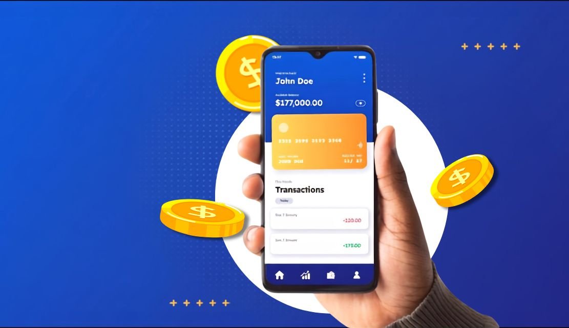
Banking apps have quietly become the primary branch. For most account holders, the app is where balances get checked, bills get paid, disputes get filed, and financial decisions get made. That shift raises the stakes for design. When onboarding stalls, when a transfer flow feels unsafe, or when a support screen buries the answer, the cost is not measured in negative reviews alone. It shows up in abandoned sign-ups, dormant accounts, higher call-centre volumes, and slower feature adoption. Exceptional banking app design converts everyday interactions into moments of trust. It reduces friction, respects compliance, and helps financial institutions grow deposits, cross-sell products, and retain customers without inflating acquisition budgets.
The competitive landscape in retail and business banking has shifted from branch density to interface quality. Neobanks, embedded finance players, and modern fintech challengers have raised customer expectations for speed, clarity, and personalisation. Traditional institutions cannot compete on physical presence alone. The app experience has become the product.
Well-designed digital experiences are consistently linked to stronger financial performance. According to research from Forrester, companies that lead in customer experience outperform laggards in revenue growth and customer loyalty. In banking, this manifests as higher digital adoption, faster product uptake, and lower churn on high-value segments such as small businesses and premium account holders.
Design also affects unit economics. A cleaner self-service flow lowers the volume of calls routed to human agents. A clearer disclosure reduces disputes. A smarter onboarding funnel raises approved-account conversion. Each of these moves the P&L, not just the customer satisfaction score.
Exceptional banking app design is not about visual polish. It is about the intersection of trust, task efficiency, and regulatory awareness. Users open the app with intent, usually short intent. They want to confirm a balance, move money, freeze a card, or check a statement. A great app removes every obstacle between that intent and its completion.
Three qualities separate exceptional apps from average ones:
The Nielsen Norman Group has long emphasised that user experience covers every aspect of the interaction between a person and a product. In banking, that includes the moments before authentication, the perceived safety of a session, and the confidence a user feels after completing a task.
Better UX in banking is not a soft benefit. It maps directly to metrics that CFOs and product leaders track. When the design team improves a specific flow, the impact usually appears in one of five places.
None of these gains require a full rebuild. Many come from targeted redesigns of high-traffic flows: login, transfer, statement, and dispute filing. A useful mental model is to treat the banking app as a portfolio of user journeys, each with its own conversion funnel. Improving one funnel by even a few percentage points at scale translates into significant annual value for the institution.
The math is straightforward. A retail bank with a large digital base sees millions of interactions each month. If a redesigned bill pay flow lifts completion by a small margin, and each completed transaction reduces a call-centre contact, the annual saving is meaningful before any revenue upside is counted. Layer in the effect of higher approved-account conversion and stronger cross-sell, and the case for investing in design becomes hard to argue against.
Most banking apps do not fail because of one catastrophic flaw. They lose ground through accumulated small frictions that discourage engagement over time. A useful redesign begins by identifying these leaks.
A structured UX audit can surface these issues quickly, quantify their impact through analytics and session recordings, and produce a prioritised backlog for the product team to work through.
A design programme without measurement is difficult to defend at budget time. Banking product teams should instrument the app so that every meaningful flow reports its own health metrics. This creates a feedback loop that shows which design changes are working and which need iteration.
Useful metrics to track include:
Pairing these quantitative signals with qualitative research such as session replays, user interviews, and support ticket analysis gives product teams a full picture. A structured UX strategy engagement can help institutions define which metrics matter most and set realistic improvement targets.
Turning insight into execution requires a disciplined design system, not a set of one-off screens. The following building blocks give banking apps the structural strength to scale without losing coherence.
Information architecture. Group functions by user goal, not internal product silo. A customer thinking about “moving money” should find transfers, bill pay, and international remittance in one predictable place.
Consistent design system. Colours, typography, iconography, and component behaviour should be codified. Every new feature draws from the same library, which reduces rework and speeds shipping.
Micro-interactions with purpose. Subtle animation confirms actions such as a successful transfer or a saved goal. These cues reassure without slowing the flow.
Data visualisation. Spending charts, balance projections, and portfolio views should communicate at a glance. Overdesigned charts confuse. Clean, labelled visuals inform.
Personalisation with restraint. Contextual recommendations work when they are relevant and infrequent. Aggressive cross-selling inside a payment flow damages trust.
For institutions building or rebuilding their mobile presence, partnering with a specialist provider of mobile app ui ux design services can compress the timeline from concept to production-ready design system.
In banking, security is not a backstage concern. It is a visible layer of the user experience. Users need to feel safe without being interrupted. Overly aggressive security checks generate abandonment. Weak or invisible checks generate anxiety.
Effective security UX blends into the flow:
Regulatory guidance from bodies such as the Consumer Financial Protection Bureau reinforces the need for clarity in disclosures, dispute rights, and account terms. Good design turns compliance obligations into readable, trustworthy screens rather than legal walls of text.
Trust also depends on how the app handles rare but high-stakes moments. A blocked card, a suspicious login attempt, or a failed international transfer can define how a customer feels about the institution for years. Designing these edge cases with the same care as the happy path is what separates institutions that customers recommend from those they quietly leave.
Banking apps serve every demographic. That means design cannot be optimised for the youngest, most tech-fluent users alone. Older account holders, users with visual or motor impairments, and users on entry-level devices all deserve a functional experience.
Meeting the Web Content Accessibility Guidelines is a baseline. Practical steps include high-contrast modes, scalable typography, voice-friendly labels for screen readers, and generous touch targets. These choices also help mainstream users in low-light conditions or on smaller screens.
Compliance adds another layer. Depending on the market, banking apps must respect frameworks such as PSD2 in Europe, GDPR for data protection, PCI DSS for card data, and local regulations from central banks. Design decisions such as consent flows, data sharing prompts, and transaction receipts should be built with these frameworks in mind, not retrofitted after launch.
Scale introduces its own demands. As feature sets grow, navigation must remain intuitive. This is where a well-governed design system, backed by regular usability testing, prevents the app from turning into a cluttered menu of legacy features.
For early-stage fintech ventures and neobanks, design is often the first product surface investors and customers judge. A polished, thoughtful interface signals maturity even when the underlying feature set is lean. Purposeful ux design for startups in the financial space focuses on validating core flows quickly, building a minimal but confident design system, and creating room for the product to evolve without a costly redesign later.
Founders working with limited runway benefit from a research-first approach. Testing wireframes and prototypes with real users before development shortens the feedback loop and reduces the risk of building the wrong thing. This is where structured UX research and rapid usability testing pay for themselves many times over.
Not every design team has banking experience, and generalist agencies often miss the regulatory and behavioural nuances of financial products. The right partner brings three things: domain fluency, delivery discipline, and a research-led method. They should be comfortable talking to compliance officers, engineering leads, and end users in the same week.
A specialist fintech UI UX design partner shortens learning curves, reduces revision cycles, and helps product teams ship with confidence. The engagement model matters too. Look for teams that integrate with your product process rather than delivering static handoffs, and that measure success against adoption, retention, and satisfaction rather than deliverable count.
Exceptional banking app design is a business investment with a measurable return. It shapes how customers open accounts, move money, resolve issues, and adopt new products. It affects unit economics as much as brand perception. Institutions that treat design as a strategic function, not a visual afterthought, build apps that customers actually want to use, and that competitors find hard to displace. The path forward is grounded in research, disciplined execution, and a clear line of sight between every design decision and a business outcome.
Banking app UX design is the practice of shaping every interaction inside a mobile banking product so that users can complete financial tasks quickly, safely, and with confidence. It covers information architecture, visual design, security touchpoints, accessibility, and compliance-aware disclosures. Good banking UX is measured by task success rates, adoption of digital features, and reduced support load rather than by aesthetics alone.
UX matters because the app is now the primary channel for most customer interactions. Poor design increases drop-off during onboarding, raises support costs, and drives customers to competitors. Strong design compounds in the opposite direction: faster onboarding, higher cross-sell rates, better retention, and lower fraud disputes. In a market where product features are quickly copied, experience quality becomes the durable differentiator.
Better design increases revenue through three main channels. First, higher onboarding conversion means more approved accounts from the same marketing spend. Second, clearer in-app product placement raises adoption of cards, loans, and investment products. Third, improved retention keeps high-value customers active for longer, which lifts lifetime value. These outcomes appear in dashboards even when the UX changes themselves seem small.
The most common mistakes include cluttered home screens that hide priority actions, excessive authentication prompts that frustrate returning users, opaque fee disclosures, weak error recovery flows, and inconsistent design patterns across sections. Many of these issues survive because they are individually minor, but together they create the sense that the app is harder to use than a competitor’s.
Timelines vary with scope. A focused redesign of a specific flow such as onboarding or transfers typically takes six to ten weeks including research, design, and validation. A full app redesign with a new design system usually runs four to six months. Working with an experienced fintech design partner can compress these timelines by reusing proven patterns and avoiding common regulatory pitfalls.
Look for domain experience in financial services, a research-led method, and a portfolio that shows measurable outcomes rather than just visuals. Ask how the team handles compliance conversations, how it validates design decisions with real users, and how it integrates with your engineering process. A short discovery engagement is often the best way to assess fit before committing to a full project. To explore this further, get in touch with UX Stalwarts for a scoping conversation.

C – 81C, Sector – 8, Noida 201301, India


1025 Beamon Drive, Franklin 37064 Tennessee, USA
Sveavagen 34 111 34 Stockholm, Sweden
A-10, Sahastradhara Rd, Doon IT Park, Dehradun, Uttarakhand

© 2026 UX STALWARTS. All rights reserved.

