Food delivery apps fail across three fronts at once. A customer loses patience waiting four seconds for a restaurant list to load and closes the app. A rider misreads a handoff screen in the rain and marks the wrong order delivered. A restaurant dashboard crashes during the dinner rush, leaving fifty tickets unaccepted. Weak Food Delivery App Design shows up as dropping order volume, rising refund claims, angry rider forums, and restaurant partners quietly delisting themselves. In a category where a single missing meal can cost lifetime customer value, small interface decisions translate directly into refund tickets, negative reviews, and operational chaos during peak service windows.
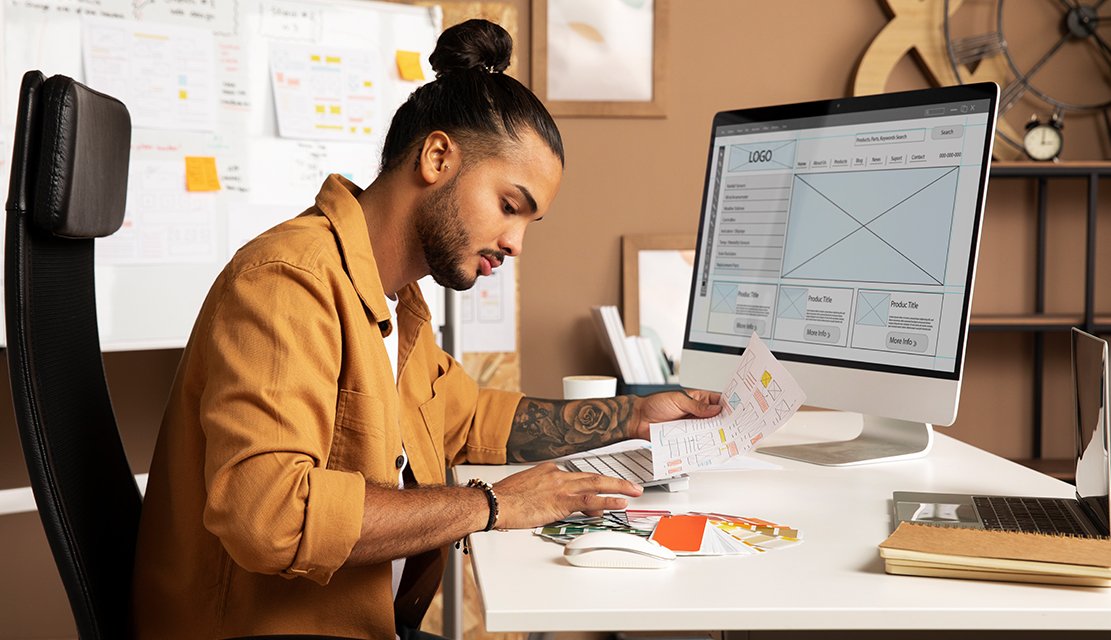
Our approach treats the product as three distinct apps that must feel like one platform. Before any screen is produced, our team studies customer ordering patterns, rider handoff workflows, restaurant kitchen display flows, and the operational pressures of peak-hour surges across city zones. From there we deliver research-backed information architecture, menu merchandising systems, live order tracking, rider navigation and earnings screens, restaurant dashboards, and component libraries tuned for heavy real-time data. As a specialized food app design company, we engineer the moments that decide marketplace health: first order, live tracking, rider handoff, restaurant ticket acceptance, and post-order review. Each screen ties to a measurable metric across all three sides of the marketplace.
Eighteen years of design work across thirty-plus countries gives our team practical fluency in how food is ordered, cooked, and delivered across very different culinary cultures. UX Stalwarts has partnered with early-stage food-tech founders launching city-zero operations and with established marketplaces modernizing aging rider and restaurant tools. Our designers read dispatch algorithms, shadow kitchen expeditors, ride along with delivery partners, and speak the vocabulary of modifier groups, item availability windows, ETA honesty, batch stacking, and surge zones. That grounding separates surface polish from a partner genuinely capable of improving unit economics. Every screen ships tied to an order, fulfillment, or retention metric we remain accountable for in production.

Customer apps, rider apps, and restaurant dashboards are each designed with equal investment. Most studios polish the consumer surface and leave partner tools rough. We design all three as first-class products because marketplace health depends on every side being easy to use, not just the one that ships ads.

Menus are the store shelf of food delivery, and modifier design, photo hierarchy, dietary filters, and combo merchandising carry direct revenue consequences. Our menu screens are designed to lift basket size without feeling pushy, using scan patterns matched to how hungry people actually decide.
Live order tracking only works when the map behaves. We engineer courier state transitions, ETA honesty, traffic-aware updates, and handoff confirmation flows rather than dropping default components onto screens. Customers trust the app when the map matches reality; they uninstall when it does not.

Rider apps often treat delivery partners like dispatch robots. Our designs respect earnings transparency, safe navigation patterns, one-hand helmet-on usability, and clear handoff flows. Happy riders stay active, deliver more orders, and generate fewer support tickets, which improves every metric marketplaces care about.

Food delivery lives and dies at dinner rush. Our designs are validated under simulated surge conditions: high ticket volume for restaurants, rapid dispatch pressure for riders, and slow-loading menus for customers in weak-network areas. Launch day cannot be the first time your product sees scale.

Food-tech teams move with campaigns, restaurant onboarding waves, and city launches. Our collaboration cadence matches that pace with weekly product syncs, shared Figma spaces, written decision logs, and direct designer access. Releases get timed around low-demand windows so launches never break service during peak.
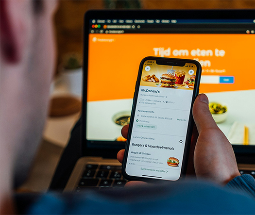
Food delivery interfaces carry direct revenue and reputation consequences. A slow menu screen loses impulse orders. A confusing cart flow burns marketing spend. A messy rider app produces wrong-order deliveries and refunds. Strong food delivery UX design services lift metrics that actually compound: first-order conversion climbs, repeat order frequency grows, rider productivity improves, restaurant acceptance rate rises, and refund tickets drop. A thoughtful team offering UI UX design for delivery apps understands decision psychology, kitchen choreography, rider realities, and the quiet moments when a hungry customer decides between your app and a competitor one tap away.
Partner with specialists who design food platforms that perform.
Every engagement follows a deliberate sequence built to balance customer delight, rider safety, and restaurant efficiency across every order cycle.

We begin by mapping the food-tech ecosystem around your business: customer segments, restaurant partner types, rider workforce realities, competitor apps, and city-level operational constraints. Existing analytics, cancellation data, refund categories, and support tickets establish the measurable baseline every design decision must eventually improve across all three sides.

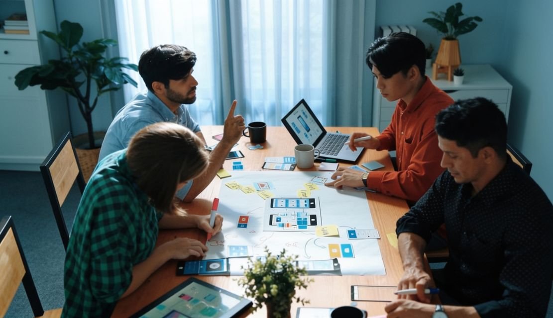
Customer, rider, and restaurant journeys are mapped separately and then stitched together. Each side captures the exact moments where one role depends on another: restaurant acceptance latency, rider assignment clarity, customer tracking trust. These blueprints guide every screen so marketplace handoffs feel seamless rather than stitched.

Menu taxonomy, modifier groups, dietary filters, combo logic, and cuisine navigation determine whether customers find craveable options fast. We structure cuisine, cart, and upsell hierarchies through tree testing and card sorting. Restaurant merchandising rules are designed in so operators can control their own presentation without breaking platform consistency.

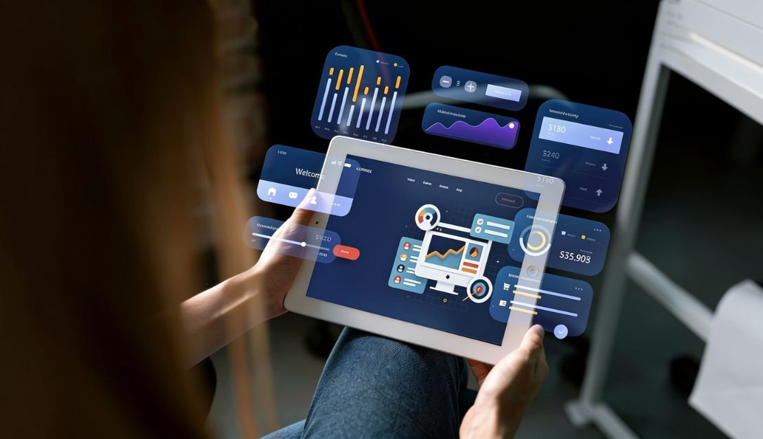
High-fidelity menu screens, tracking views, rider navigation, and restaurant ticket dashboards ship alongside a component library tuned for real-time data density. Status transitions, ETA displays, item availability, and payment cues are weighted through visual hierarchy that guides the next tap. Accessibility review happens before engineering handoff.

Designs are stress-tested under simulated surge conditions. Restaurant ticket queues, rider batch stacking, customer cart race conditions, and map update cadence are all validated before launch. Edge cases like out-of-stock items mid-checkout, courier reassignment, and partial refunds are designed explicitly rather than left for engineering guesswork.

Post-launch, three-sided data guides refinement. Order conversion, cart abandonment, rider acceptance rate, restaurant delisting rate, refund categories, and review sentiment are monitored against the Phase One baseline. Where gaps emerge, targeted revisions ship in structured sprints so every side of the marketplace keeps improving quarter after quarter.
Drawn from over one thousand engagements, these projects reflect measurable outcomes across restaurant apps, rider platforms, and delivery marketplaces worldwide.
Foundational values behind every food-tech engagement are craving clarity, rider trust, and restaurant operational respect. Teams evaluating restaurant app design services weigh food-tech fluency against execution speed, and both matter here. From pre-launch founders piloting city-zero operations to established marketplaces modernizing aging three-sided platforms, our team operates across the maturity spectrum. Design decisions balance immediate customer needs against the runway required for restaurant network and delivery fleet expansion.
Industry coverage spans marketplace delivery platforms, single-restaurant ordering apps, cloud kitchens, dark stores, grocery delivery, coffee and bakery chains, alcohol delivery, meal subscription services, and corporate meal programs. Our online food ordering app design work extends across consumer apps, partner operations, and B2B catering platforms. Exposure to these adjacent verticals gives designers a transferable pattern library that sharpens decisions across every restaurant food ordering app UI engagement we take on.
Choosing the best UI UX design company for food apps comes down to marketplace fit, not reputation alone. UX Stalwarts has been cited in food-tech publications, shortlisted for international design awards, and referenced in marketplace case studies because the output lifts conversion and operational health across all three sides rather than just refreshing visual style. Three commitments explain why operators pick us.
Equal Rigor Across Three Sides: Customer, rider, and restaurant interfaces receive the same design investment, because marketplace economics depend on every participant having a good day.
Merchandising As Engineered Craft: Menu design, upsell logic, and modifier flows are treated as revenue-critical work, not decoration, lifting basket size without feeling aggressive.
Operational Reality Discipline: Designs are pressure-tested for rush hour, weak networks, and unpredictable city conditions before launch, because real food delivery never matches a perfect demo environment.
Our studio uses category-leading tools selected for collaboration speed, engineering handoff accuracy, and real-time analytics integration across every on-demand food delivery app design engagement we deliver.


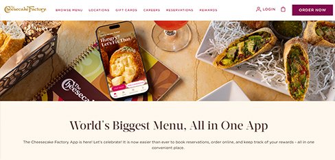
Having 250 menu items is our strength in the restaurant but a nightmare online. Guests went to DoorDash because our direct experience was overwhelming. UX Stalwarts made our massive menu browsable and customization intuitive. Direct digital sales jumping 68 percent means we keep more margin on every off-premise order.
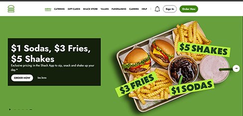
Our app had a 3.2-star rating which was embarrassing for a quality-obsessed brand. UX Stalwarts rebuilt it with the same care we put into our food. Hitting 4.8 stars in 90 days and mobile orders doubling proved our guests want convenience only if it matches the Shake Shack standard.
Cracker Barrel is a destination restaurant so off-premise was an afterthought at 14 percent. UX Stalwarts designed an app that makes ordering our comfort food for home as warm as dining with us. Off-premise revenue jumping 52 percent and the family meal builder becoming our top digital feature proved our food travels well when the ordering experience does too.
The questions marketplace founders ask before choosing a design partner.
Start with food-tech specificity. A reliable food delivery app design company starts here. A generalist studio that has never shipped a rider app or a restaurant dashboard will miss where marketplaces actually break down. A proven food delivery app design partner brings three-sided marketplace fluency, not just customer-app portfolios. Ask for before-and-after conversion and refund numbers rather than aesthetic case studies. Shortlist food delivery app design firms with proof. Check experience with live tracking, modifier menus, and batch dispatch logic. Review component libraries designed for real-time data. Top food delivery app UI UX design agencies show this depth. A credible partner among top food delivery app design agencies defends decisions to product, ops, and finance leads in one meeting. Portfolios alone never reveal whether the studio actually shipped production rider or restaurant interfaces at scale.
Pricing for food delivery app design services varies with scope, marketplace complexity, and partner count. Mature food delivery app design solutions reflect that range. A focused UX audit on an existing app typically starts in the low five figures. A full engagement covering customer, rider, and restaurant apps with research, menu architecture, live tracking, dashboards, and a component library usually runs higher five-figure to six-figure range. Single-side redesigns cost significantly less than full marketplace builds. Most food delivery app design companies price this way. Food delivery app design services pricing ultimately depends on side count, city scope, integration depth, localization requirements, and post-launch support. Transparent scoping before contract signature prevents commercial surprises. Pilot sprints focused on one high-leverage flow are also available for early-stage teams. Selecting a food delivery app design agency this way reduces risk.
Timelines depend on scope and side count. A targeted audit with prioritized recommendations typically takes three to four weeks. Scoped food delivery app system design services follow this rhythm. A single-side redesign like customer ordering or rider navigation runs six to eight weeks including validation. Each mobile food delivery app design service stays on cadence. A full three-sided engagement covering customer, rider, and restaurant apps with discovery, menu architecture, live tracking interfaces, and a documented component library generally runs sixteen to twenty-four weeks. Enterprise rebuilds involving multi-city rollouts, cloud kitchen operations, or loyalty platform redesigns extend further. Teams that design food delivery app rebuilds budget for this. Mobile app design for food ordering app development design engagements are scoped in two-week milestones so product, operations, and engineering teams can evaluate progress continuously across cohort data.
A structured engagement follows six sequential phases. Disciplined food delivery UI UX design services depend on this order. First, marketplace discovery collects three-sided analytics, operational data, and competitor benchmarks. Second, three-sided journey mapping captures customer, rider, and restaurant paths separately then stitches handoffs. Third, menu architecture validates taxonomy, modifiers, and cart logic through tree testing. Fourth, real-time interface work produces high-fidelity menu, tracking, and dashboard screens against a component library. Fifth, peak-hour validation stress-tests designs under simulated surge conditions before development. A capable food delivery UI UX design agency commits to this step. Sixth, marketplace iteration tracks post-launch performance across all three sides. Each phase ends with a signed-off deliverable. Strong ui design food delivery app outcomes hinge on these sign-offs. This sequencing is why food app design and mobile app UI UX for restaurants engagements protect timeline and marketplace integrity together.
Three things separate our food-tech work. They explain why a strong food delivery app design company stands out. First, three-sided rigor. Customer, rider, and restaurant apps receive equal design investment, because marketplace health depends on every side being easy to use. Second, menu merchandising as craft. Modifier flows, dietary filters, and combo upsells are treated as revenue work, not decoration. A serious food delivery platform UI UX design company invests here. Third, operational reality discipline. Honest ui design for food delivery app screens reflects this. Designs get stress-tested under simulated surge before launch, respecting real city conditions. A proven food app design company applying this discipline consistently ranks as a strong contender when teams evaluate the best UI UX design company for food apps. Portfolio polish alone never reveals whether a studio has shipped production marketplace interfaces under real load.
Starting is deliberately lightweight. Teams ready to hire food delivery app designer talent move fast. A brief discovery call covers marketplace stage, city footprint, restaurant partner count, rider fleet size, known pain points, and desired outcomes. Within five working days you receive a scoped proposal covering phased milestones, deliverable samples, team composition, timeline, and commercial terms. A proven food delivery app ui design agency keeps scoping clear. A paid pilot sprint focused on one high-leverage flow is available for teams wanting to test chemistry before committing to a full three-sided engagement. Most clients move from first conversation to kickoff within two weeks. A focused restaurant app design agency matches this pace. You can begin with a short enquiry, share marketplace documentation under NDA, or explore related capabilities through our broader UX design services page as a starting reference.
Several adjacent capabilities compound the impact of food-tech product design. A modern food delivery product design agency layers them deliberately. A mature design system accelerates every new feature release and protects consistency across customer app, rider app, restaurant dashboard, web, and marketing surfaces. Conversion rate optimization sharpens funnel performance through continuous A/B testing on menu, cart, and checkout flows. A skilled mobile food delivery UX design agency builds these tests in. UX design services and UI design agency craft pair well with motion design for live tracking animations, accessibility audits for inclusive ordering, and dedicated usability testing for new flows. Selection depends on stage; early marketplaces prioritize three-sided flows, while mature platforms gain more from optimization and analytics-driven iteration across geographies. Leading food delivery apps design firms guide this selection.
Every engagement is scoped around the specific food-tech model, not a template. Specialist food delivery app design firms work this way. A marketplace aggregator has different needs than a single-restaurant ordering app. A cloud kitchen operation requires different dashboards than a traditional dine-in restaurant. Senior food delivery app design companies plan for both. Our UI UX design for delivery apps differs across aggregators, direct brands, and dark stores. Restaurant food ordering app UI for quick-service chains looks different from premium fine-dining pickup apps. Top food delivery app UI UX design agencies handle these splits. App design for food startups typically focuses on three-sided MVP validation, while enterprise programs cover multi-city, multi-cuisine marketplaces. Discovery produces a custom engagement plan accounting for marketplace model, city footprint, partner mix, and commercial priorities specific to your product.
Yes, and it is usually where meaningful marketplace wins happen. Long-running food delivery app design solutions prove this out. After launch, real customer, rider, and restaurant behavior often differs from research predictions in small but important ways. Retainer options range from enterprise programs to lighter engagements for smaller marketplaces. A reliable food delivery platform UI UX design company supports both. Typical support covers ongoing design iteration, component library expansion, seasonal campaign support, rider earnings dashboard updates, periodic usability studies, and analytics-driven optimization of menu and checkout flows. Refined ui design for food delivery app screens evolves through this. A dedicated food delivery mobile app design team keeps that rhythm consistent through city launches, restaurant onboarding waves, and regulatory changes. Remote validation plays a central role here, covered in our guide to remote usability testing.
Coverage spans marketplace aggregators, quick-service restaurants, cloud kitchens, dark stores, grocery delivery, coffee chains, alcohol delivery, meal subscriptions, and corporate catering. Teams that design food delivery app systems across these models scale faster. Clients range from pre-launch founders to listed food-tech groups operating across India, the United States, the United Kingdom, the GCC, and Southeast Asia. Each mobile food delivery app design service is calibrated by region. A regionally experienced team understands that Indian customers rely heavily on vegetarian and spice-level filters, GCC markets require halal certification visibility, and Western markets prioritize allergen tagging and nutritional data. Pattern transfer across categories is deliberate; a proven modifier group design for quick-service often accelerates grocery variant selection decisions because scan behavior and decision psychology repeat across adjacent ordering contexts. Cross-category food delivery app system design services accelerate this transfer.
Cart abandonment in food delivery reflects friction, timing, and trust. Sharp ui design food delivery app screens address all three. Our method combines four techniques. First, transparent pricing surfaces delivery fees, surge, and taxes early rather than at final checkout shock. Second, cart recovery notifications respect dinner rhythms rather than hammering users at lunchtime for a cart abandoned yesterday. Mature food delivery UI UX design services time these touchpoints carefully. Third, one-tap payments, saved addresses, and stored modifier preferences remove friction for repeat orders. Fourth, honest ETAs rebuild trust at the exact moment hesitation spikes. A disciplined food delivery UI UX design agency designs around that moment. Disciplined food delivery UX design services and thoughtful food delivery app UI design combined with genuinely tested food delivery app UX design can lift conversion by double-digit percentages without touching pricing or marketing spend.
Live tracking only builds trust when the map matches reality. Teams that hire food delivery app designer specialists prioritize this. Our approach designs courier state transitions explicitly: restaurant accepted, preparing, ready for pickup, rider en route, arriving now, delivered. ETAs update honestly rather than hiding delays. Map density respects city traffic patterns. A grounded restaurant app design agency tests these flows. Rider location updates balance battery and bandwidth without lying about courier position. Restaurant dashboards show the same state machine so partners know exactly when to start cooking. A capable food delivery app ui design agency keeps this aligned. Mobile app UI UX for restaurants and mobile fitness-style precision applied to food tracking interfaces reduces support tickets sharply. Customers tolerate real delays; they uninstall over dishonest ETAs and silent failures.
Cross-border food delivery demands more than currency conversion. A seasoned food delivery product design agency plans for this. Cuisine categories, dietary preferences, payment methods, and trust signals vary sharply by market. Our approach builds flexible templates that localize menus, pricing, legal disclosures, and promotional formats while preserving brand consistency. Right-to-left layouts for Gulf markets, localized food imagery, and multi-script rendering are designed in from day one. A globally trained mobile food delivery UX design agency anticipates these layers. Our article on multi-language interface design for global platforms covers the broader localization approach. App design for food startups expanding internationally benefits from this flexibility early; retrofitted localization is slower and costs more than designing global-ready from the first wireframe. Forward-thinking food delivery apps design firms favor the early approach.
Yes. Food delivery design systems carry specific requirements beyond general product systems. Components must handle menu cards, modifier groups, dietary badges, real-time status transitions, surge indicators, rider earnings tiles, restaurant ticket cards, and regulatory disclosures like allergen warnings. Our system engagements produce tokenized foundations, a production-ready component library, documented accessibility behavior, and developer handoff kits across customer, rider, and restaurant apps. For enterprise marketplaces, long-term stewardship matters as much as initial build, which we explore in our article on design system governance. Food delivery app design services pricing always reflects system depth requested.
Measurement begins before design. During discovery we capture baselines across all three sides: customer first-order conversion, cart abandonment, repeat order frequency, rider acceptance rate, rider earnings satisfaction, restaurant acceptance latency, refund rate, and support ticket categories. After launch the same metrics are re-measured at thirty, sixty, and ninety days. Secondary signals include menu-to-cart conversion, modifier engagement, ETA accuracy variance, and app store sentiment across all three apps. Quarterly reviews tie design decisions back to unit economics, partner retention, and customer lifetime value. Measurement discipline across every food delivery mobile app design and restaurant food ordering app UI engagement distinguishes cosmetic redesigns from durable marketplace improvement.

C – 81C, Sector – 8, Noida 201301, India


1025 Beamon Drive, Franklin 37064 Tennessee, USA
Sveavagen 34 111 34 Stockholm, Sweden
A-10, Sahastradhara Rd, Doon IT Park, Dehradun, Uttarakhand
© 2026 UX STALWARTS. All rights reserved.