
Mobile interfaces carry a visible cost when craft slips. A misaligned tab bar leaks amateurism across every screen. Typography scales that ignore Dynamic Type or Android text scaling betray a team that skipped platform homework. Icons drawn at three different visual weights make a product feel assembled rather than designed. Export files that developers have to reconstruct by hand burn sprint hours and generate rendering inconsistencies. Weak mobile app UI design shows up as App Store and Play Store ratings that mention the interface specifically, developer frustration during handoff cycles, brand teams quietly redesigning screens after launch, and the kind of app-review screenshots that never earn an editorial feature from Apple or Google.
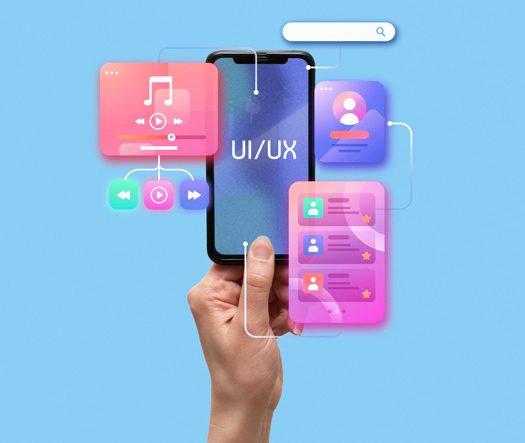
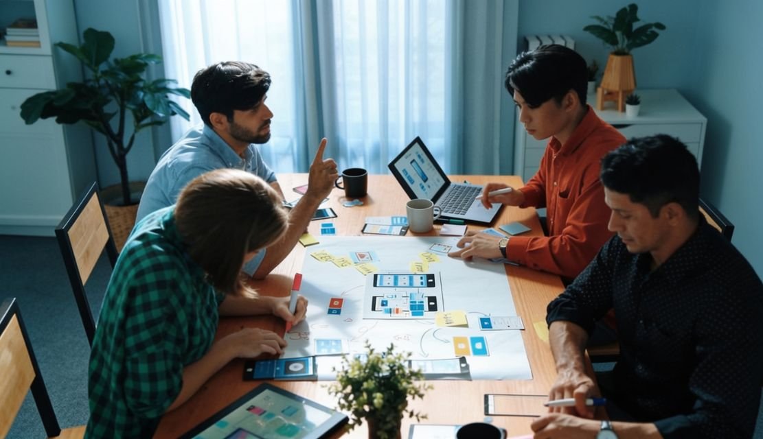
Our approach treats UI as visual engineering, not decoration layered onto wireframes. Before pixels move on artboards, our team studies brand language, target device ranges, platform conventions across iOS Human Interface Guidelines and Material Design 3, and the actual font, color, and spacing systems that will ship. From there we deliver pixel-ready screens, design tokens, typography scales, iconography, motion specifications, and component libraries prepared for Figma-to-Xcode and Figma-to-Android Studio handoff. As a specialized app UI design company, we engineer the visible surface that users judge in three seconds: launch screen, home tab, first core flow, and every moment the brand earns or loses trust through polish. Every file ships production-ready.
Eighteen years of design work across thirty-plus countries gives our team deep fluency in mobile visual craft across brand categories, regional aesthetics, and platform conventions. UX Stalwarts has partnered with early-stage founders who need one perfect app before Series A and with established brands rolling out visual updates across dozens of feature screens. Our designers read Dribbble and Mobbin weekly, collaborate with mobile engineers through sprint reviews, and speak the vocabulary of design tokens, semantic color roles, icon stroke weights, elevation rules, and the small details that separate portfolio-polish from ship-ready files. That fluency distinguishes a generic mobile shop from a mobile UI UX design services partner genuinely capable of producing interfaces developers love implementing.

iOS and Android deserve respectful platform adaptation, not copy-paste identical designs. Our team designs with each platform’s conventions in mind so iOS screens feel native on iPhone while Android versions feel native on Pixel and Samsung, yet both maintain brand consistency users recognize instantly across devices without jarring style shifts.

Colors, spacing, typography, elevation, and motion are tokenized from the start rather than extracted after screens exist. Token systems power Dark Mode variants, dynamic color, and accessibility scaling without breaking layouts. Developers implement faster because tokens map cleanly to iOS and Android theming systems already present in their engineering stack.

Mobile typography carries heavier weight than desktop because of reading distance, glanceability, and platform scale differences. Our type systems build on SF Pro, Roboto, or brand-specific typefaces with semantic scales tied to real content needs rather than arbitrary visual hierarchies that collapse during accessibility scaling or localization expansion.
Inconsistent icons signal inconsistent thinking. Our icon libraries use uniform stroke weights, grid alignment, terminal treatments, and semantic naming so every glyph feels drawn by one hand. Custom iconography complements platform libraries like SF Symbols and Material Symbols rather than fighting with them across screens.

Micro-interactions carry brand personality. Tap feedback timing, transition easing, loading states, and cue animations receive deliberate design attention rather than being left to engineering guesswork. Motion specifications ship with precise durations, easing curves, and trigger conditions so the final product moves the way the team intended.

Figma files are built to be implemented, not admired. Named layers, organized components, exported assets at correct densities, documented edge cases, and annotated interaction patterns save sprint hours for engineering teams. Developer satisfaction translates into faster ship velocity and fewer reworked screens after review sessions catch inconsistencies.
Mobile UI carries measurable perception consequences. Sloppy visual hierarchy drops app store ratings below three stars over specific screens users mention in reviews. Inconsistent typography across tabs signals amateur work to enterprise buyers evaluating procurement. Poorly specified motion collapses into janky animations that haunt brand teams for years. Strong UI design for mobile apps elevates perception in ways that compound: reviews shift toward praising polish, editorial features become plausible, conversion climbs because users trust the brand, and engineering handoff cycles shorten. A thoughtful mobile application UI design partner understands the visible moments where craft either earns user trust or quietly undermines every marketing dollar spent.
Partner with specialists who treat mobile UI as visual engineering
Every engagement follows a deliberate sequence built to produce visually consistent, platform-respectful, developer-friendly UI that ships without rework cycles.

We begin by mapping the visual reality around your product: brand language, platform targets, device range, competitor visual standards, and handoff stack. Existing screens, brand guidelines, and engineering framework choices establish the baseline every design decision builds on. Visual ambition is calibrated against what your team can realistically maintain across releases.

Design tokens come before screens. Color roles, spacing units, elevation levels, motion curves, and typography scales are defined as the underlying system that every artboard will consume. Tokens are structured to support Dark Mode, dynamic color, accessibility scaling, and localization expansion without requiring artboard-level fixes later during production sprints or platform update cycles.
Typography scales build on platform-native typefaces or licensed brand fonts with semantic naming tied to content roles rather than arbitrary size jumps. Icon systems are drawn on shared grids with consistent stroke weights and terminal treatments. Platform library pairings with SF Symbols and Material Symbols are documented so engineering uses the right assets at each moment.

High-fidelity screens ship alongside a full design system built on tokens. Responsive UI design across screen sizes, Dark and Light variants, platform adaptations for iOS and Android, and motion specifications for every interactive surface are delivered together. Custom mobile app UI design work integrates with existing brand systems rather than forcing clients to choose between brand coherence and platform fluency.

Finished screens are audited for visual consistency across the entire app. Spacing alignment, typography rhythm, color application, elevation logic, and motion cadence all face structured review before handoff. Edge cases like extra-long localized text, Dark Mode contrast, and accessibility scaling are tested explicitly so no surprises surface during engineering implementation.

Handoff is a deliverable, not an event. Figma files ship with named layers, organized components, documented tokens, exported assets at correct densities, and annotated interaction specifications. Our team stays available during engineering implementation to answer spec questions, approve small adaptations, and review the built product against design so the final app matches intent at pixel level.
Drawn from over one thousand engagements, these projects reflect measurable visual outcomes across consumer apps, enterprise tools, and subscription products launched on iOS and Android globally.
Foundational values behind every UI engagement are visual discipline, platform respect, and handoff quality. Teams looking to compare UI design agencies for apps weigh craft evidence against execution reliability, and both matter in real product work. From founders preparing first app launches to established brands rolling out visual refreshes across many screens, our team operates across the maturity spectrum. Design decisions balance immediate visual ambition against the token-system runway required for consistent scaling across future feature releases.
Industry coverage spans consumer lifestyle, health and fitness, fintech, productivity, media, social, commerce, travel, and enterprise mobile tools. Our mobile UI design services extend across consumer and B2B products where visual quality directly shapes perception. Pattern transfer from custom mobile app UI design engagements across categories sharpens decisions on whether app interface design services should lean toward platform-native restraint or brand-expressive distinctiveness for each specific product context.

Choosing among app UI design portfolio for mobile apps comes down to craft fit, not scale alone. UX Stalwarts has been cited in mobile design publications, shortlisted for international design awards, and referenced in client case studies because the output lifts visual perception, ratings, and developer satisfaction rather than just populating portfolio pages for marketing refreshes.
Tokenized From First File: Design tokens exist before screens are built, so visual consistency scales across feature releases without requiring retroactive cleanup sprints every few quarters.
Platform-Respectful Parity: iOS and Android get adapted craft, not copy-paste duplication, so native users on both platforms feel the product was made specifically for their device.
Developer-Loved Handoff: Figma files arrive production-ready with named layers, organized components, exported assets, and annotated interactions that engineering teams genuinely appreciate implementing.
Our studio uses category-leading tools selected for visual craft precision, token-system discipline, and developer handoff quality across every UI UX design agency for apps engagement and mobile app interface design services project we deliver.


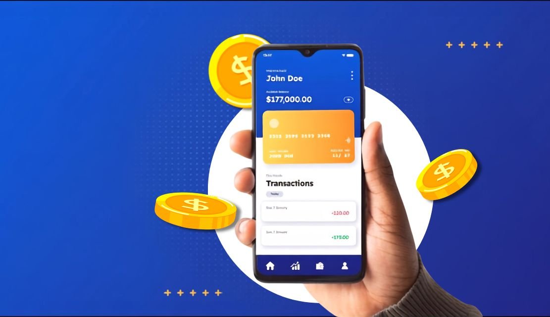
Our app was designed for American freelancers but most of our growth was coming from markets where people use $100 phones on 3G networks. UX Stalwarts redesigned for global reality with cultural adaptation, offline capability, and budget device optimization. Emerging market adoption growing 134 percent proved that inclusive design is not just ethical, it is our biggest growth opportunity.
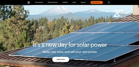
Homeowners were spending $25,000 on solar systems and then opening our app twice a month because the data was engineering gibberish. UX Stalwarts translated everything into dollars and actionable insights. Engagement jumping 3.4X and support callbacks dropping 52 percent proved that when homeowners understand their solar investment, they engage with it and recommend it to others.
Customers avoided calling us because 14-minute hold times made service requests feel like punishment. UX Stalwarts designed a 45-second mobile request with live tracking and contractor messaging. Repeat bookings jumping 67 percent and renewals improving 22 percent proved that when you make home services effortless, customers use them more and stay longer.
The questions product and brand leaders ask before choosing a UI partner.
Start with craft specificity. Studios that blur UI with UX often under-deliver on pure visual work. When you need polished screens, token systems, and developer-ready handoff, the agency must show visual craft evidence directly rather than only UX process. Candidates worth considering among app UI design company options demonstrate cross-platform parity, Dark Mode handling, accessibility scaling, and typography rigor rather than only hero screens for portfolio appeal. Ask to compare UI design agencies for apps across specific questions: how do they tokenize, how do they handle iOS versus Android adaptation, how do developers rate their handoff. Craft is visible in files, not in marketing language. Portfolio polish means nothing without production-ready deliverables behind it. Top mobile app ui design agency. Best mobile app ui design agency and mobile ui ux design company.
Pricing for mobile UI design services varies with scope, screen count, platform count, and system depth. A focused refresh covering a handful of screens with existing tokens typically starts in the low five figures. A complete app UI design company engagement covering token systems, typography scales, iconography, and twenty to forty production screens across iOS and Android usually runs mid-five to six figures. Enterprise programs involving multiple apps, brand rollouts, or ongoing visual optimization across feature releases reach higher. Mobile UI design services pricing depends on token-system depth, platform parity requirements, motion specification scope, and post-handoff support. Transparent scoping prevents commercial surprises during brand-team and engineering reviews. Custom mobile app ui design services, mobile app ui ux design services scope. Mobile app ui ux design services and mobile app ui design company.
Timelines depend on scope and platform count. A visual refresh of ten to fifteen screens typically takes four to six weeks. A complete system engagement covering tokens, typography, icons, and twenty to forty screens across iOS and Android generally runs ten to fourteen weeks. UI UX design agency for apps engagements covering combined UX research and UI craft extend longer based on added discovery phases. Cross-brand rollouts across multiple apps or feature-heavy programs reach sixteen to twenty weeks. We scope in two-week milestones with visible deliverables so brand, product, and engineering teams can evaluate progress continuously rather than only at final presentation moments which rarely catch issues early. Mobile app ui ux design firms, mobile app ui design firms timelines. Mobile app ui ux design firms and ui ux design for mobile apps.
A structured engagement follows six sequential phases. First, visual brief collects brand language, platform targets, and handoff stack context. Second, token system defines color roles, spacing, elevation, motion, and typography scales before screens exist. Third, typography and icon work establishes type systems and custom iconography aligned with platform libraries. Fourth, screen craft produces high-fidelity production screens across platforms. Fifth, visual consistency validation audits the complete set before handoff. Sixth, handoff and support continues through engineering implementation. Each phase ends with a signed-off deliverable. This mobile app UI design process reflects mobile app UI design best practices distilled from shipped engagements rather than generic agency frameworks adopted for marketing purposes. Mobile app interface design services, mobile app ui design companies apply. Mobile application ui design firms and professional mobile ui design company.
Three things separate our UI work. First, tokenized from first file. Design tokens exist before screens, so consistency scales across releases. Second, platform-respectful parity. iOS and Android receive adapted craft rather than copy-paste duplication. Third, developer-loved handoff. Figma files ship production-ready with named layers, organized components, and annotated interactions. A proven mobile app UI design services practice applying these commitments consistently appears on shortlists when teams evaluate partners. Portfolio polish alone rarely reveals whether a studio produces files developers actually enjoy implementing. Ask for references from engineering leads rather than only from marketing or product managers to validate the handoff quality genuinely. Best mobile app ui design agency, top mobile app ui design agency, best mobile app ui design agencies. Best mobile app ui design agencies and mobile ui app design firms.
Starting is deliberately lightweight. A brief discovery call covers product stage, platform scope, brand maturity, handoff stack, known visual pain points, and desired outcomes. Within five working days you receive a scoped proposal covering phased milestones, deliverable samples, team composition, timeline, and commercial terms. A paid pilot sprint focused on one core flow like onboarding or checkout is available for teams wanting to evaluate craft fit before committing to larger engagement. Most clients move from first conversation to kickoff within two weeks. You can begin with a short enquiry, share brand documentation under NDA, or explore related capabilities through our broader UX design services page as a starting reference for how engagements are structured. Custom mobile app ui design services. Best ui design for mobile app and mobile app ui design companies.
Several adjacent capabilities compound the impact of UI craft. A mature design system accelerates every new feature release and protects consistency across platforms, web, email, and marketing surfaces. Conversion rate optimization sharpens acquisition funnel performance through continuous A/B testing on signup and onboarding flows where visual craft directly shapes first impressions. UI design services for startups often pair core UI work with dedicated usability testing, accessibility audits, and motion design for state transitions. Design systems for apps benefit especially from ongoing stewardship across multi-release roadmaps. Selection depends on stage; early-stage founders prioritize first-launch polish, while established brands gain more from system governance. Ui ux design for mobile apps, ui ux design mobile apps, ui ux mobile app design companies. Mobile apps ui/ux design service and ui/ux design for mobile apps services.
Every engagement is scoped around the specific product, not a template. A consumer fintech app has different visual considerations than an enterprise productivity tool. A luxury fashion commerce app requires different photography and typography treatment than a utility app focused on speed. A social platform demands different motion language than a banking app. Our app interface design services adapt across lifestyle, finance, commerce, productivity, media, and enterprise categories. Custom mobile app UI design for brand-expressive products balances platform fluency with distinct visual identity, while enterprise apps lean toward restraint. Discovery produces a custom engagement plan accounting for brand positioning, audience expectations, and device-tier reality specific to your product roadmap. Mobile app ui design company, mobile app ui design solutions delivery.
Yes, and it is often where UI quality either holds steady or drifts over time. After launch, feature releases require new screens that must match existing craft. Retainer options cover ongoing screen production, component library expansion, seasonal campaign UI, motion system extensions, accessibility improvements, and platform-update alignment as iOS and Android release yearly. A dedicated mobile UI partner keeps the visual system coherent as teams grow and new hands touch the files. Remote validation plays a central role during retainer sprints, covered in our guide to remote usability testing when visual changes need validation with distributed user panels across regions beyond the design studio. Mobile ui ux design company, professional mobile ui design company, mobile ui design agency retainers.
Coverage spans consumer lifestyle, health and fitness, fintech, productivity, media, social, commerce, travel, and enterprise mobile tools. Clients range from pre-launch founders to established brands across India, the United States, the United Kingdom, the GCC, and Southeast Asia. A regionally experienced team understands that Indian mobile users value performance across mid-range devices, US markets prioritize subscription visual clarity, GCC markets increasingly require Arabic-first interfaces with right-to-left typography, and SEA markets mix flagship and budget device reality simultaneously. An app UI design company India delivery capability makes us a strong option for global founders seeking polished craft combined with cost efficiency. Mobile app design trends vary regionally and our team tracks them. Ecommerce mobile app ui design agency engagements globally.
UI design and UX design are distinct disciplines that often ship together but solve different problems. UX design addresses research, user journey mapping, information architecture, and flow logic. UI design addresses the visible surface: typography, color, spacing, iconography, motion, and visual rhythm. Understanding UI vs UX in mobile app development clarifies scope: engaging a studio for UI alone works when UX decisions are settled and screens need craft polish. Engaging for both works when a product is building from scratch or undergoing complete redesign. Our team delivers either or both, scoped transparently so you pay for what you actually need. Conflation of these disciplines inflates cost without matching quality improvement. Mobile apps ui/ux design service, ui ux design mobile apps.
Accessibility shapes UI inputs rather than post-launch patches. Color contrast ratios meet WCAG standards while aligning with platform aesthetic systems. Typography scales support iOS Dynamic Type and Android font scale across all eleven categories. Touch targets respect minimum sizes across platforms. Dark Mode variants receive genuine craft rather than inverted versions of light screens. Icon clarity holds at small sizes and with screen readers. Motion systems respect Reduce Motion preferences. Our article on UX accessibility audits covers broader inclusive thinking. Accessible mobile UI widens total addressable market, earns editorial feature chances on both Apple and Google platforms, and protects against policy shifts both companies actively tighten. Best ui design for mobile app and mobile app user interface design agency accessibility.
International mobile UI demands more than translated text. Font rendering for CJK and Indic scripts, right-to-left layout support for Arabic and Hebrew, text expansion for German and Russian, numerical localization, and cultural symbol sensitivity vary sharply by market. Our article on multi-language interface design for global platforms covers broader localization approach. Responsive UI design anticipating expansion from day one costs less than retrofitted localization during launch crunch when every extended string breaks layouts and delays approval. Typography systems that tolerate expansion, icon meanings that cross cultures, and color choices that avoid regional associations ship faster than monolingual designs forced into other markets later. Spans mobile ui app design firms, mobile application ui design firms, ecommerce mobile app ui design agency.
Yes. Design systems for apps carry specific requirements beyond generic product systems. Components must handle platform adaptation across iOS and Android, token-based theming, Dark Mode variants, dynamic color on Android, accessibility scaling, localization expansion rules, haptic feedback specifications, and motion curves per platform. Our system engagements produce tokenized foundations, a production-ready component library, documented accessibility behavior, animation patterns, and handoff kits that reduce engineering rework meaningfully. For brands with multiple apps or white-label strategies, long-term stewardship matters as much as the initial build, which we explore in our article on design system governance applied to mobile contexts specifically. Mobile app user interface design agency, ui ux mobile app design companies, ui/ux design for mobile apps services.
Measurement for UI specifically focuses on visual and handoff signals rather than only UX metrics. Pre-handoff signals include visual consistency audit results, token coverage percentages, component reuse rates, and accessibility compliance coverage. Post-launch signals include app store review sentiment mentioning interface quality, editorial feature chances, engineering-reported handoff satisfaction, and rework rate during implementation. App store rating averages, App Tracking Transparency or permission opt-in rates, and subscription conversion often improve alongside visual craft. Quarterly reviews tie UI decisions back to brand perception, developer velocity, and audience sentiment. Measurement discipline across every mobile app UI design engagement separates portfolio polish from production quality users and engineering teams genuinely notice daily. Mobile app ui design solutions, mobile app ui design firms measurement.

C – 81C, Sector – 8, Noida 201301, India


1025 Beamon Drive, Franklin 37064 Tennessee, USA
Sveavagen 34 111 34 Stockholm, Sweden
A-10, Sahastradhara Rd, Doon IT Park, Dehradun, Uttarakhand
© 2026 UX STALWARTS. All rights reserved.

