
More than half of all web traffic now originates from mobile devices, yet many business websites still deliver fractured experiences on smaller screens. When layouts break, text becomes unreadable, or buttons fail to respond on a phone or tablet, visitors leave. That lost engagement translates directly into lower search rankings, fewer qualified leads, and missed revenue. Organizations that treat responsive website development as optional are building a gap between their brand and their buyers that widens with every algorithm update and every shift in user behavior.
Our responsive web design services start with understanding how your specific audience interacts with your product across devices. From there, we architect fluid grid systems, scalable typography, and optimized media that render cleanly from a 4-inch phone screen to a 32-inch monitor. Every project includes mobile first and responsive web design principles baked into the foundation, not layered on afterward. The result is a single, maintainable codebase that loads fast, ranks well, and guides visitors toward measurable outcomes like form completions, purchases, or demo requests.
With eighteen years of cross-industry experience and over 1,000 client engagements, UX Stalwarts brings a level of precision to responsive design web development that generic agencies cannot match. Our teams combine user research, accessibility compliance, and front-end engineering into a unified workflow. That means fewer revision cycles, faster launches, and digital products that hold up as devices, browsers, and expectations continue to evolve.

Every responsive project begins with device analytics, heatmap reviews, and user journey mapping specific to your audience segments. We identify exactly where visitors interact, abandon, or convert on each screen size. This evidence shapes every breakpoint decision, so layouts solve real usability problems rather than following assumptions. The outcome is measurable improvement in on-site engagement from day one.

Rather than relying on a handful of standard screen widths, we define breakpoints based on your content and user data. Each transition between screen sizes preserves hierarchy, readability, and conversion paths without layout shifts or hidden elements. This content-first breakpoint strategy ensures your responsive website design service delivers consistent value whether someone browses on a foldable phone or an ultrawide desktop display.

Healthcare portals, fintech dashboards, e-commerce storefronts, and SaaS platforms each carry distinct responsive challenges. Our experience across regulated and high-traffic industries means we anticipate compliance needs, data-heavy layouts, and complex navigation patterns before they become project risks. Clients benefit from solutions that reflect tested patterns, not experimental guesses.

Responsive design is only valuable if pages load quickly on every connection speed. Our front-end engineers write lean, semantic HTML and modular CSS that minimizes render-blocking resources. Images are served through responsive srcset attributes, and scripts load asynchronously. The result is a site that scores well on Core Web Vitals and keeps bounce rates low across mobile networks and high-speed connections alike.

Responsive layouts that ignore accessibility exclude a significant portion of your audience. We integrate WCAG 2.2 compliance into every responsive build, covering touch target sizing, contrast ratios across themes, keyboard navigation flow, and screen reader compatibility. This approach reduces legal exposure, broadens your addressable market, and signals to search engines that your site prioritizes inclusive design.

Clients receive access to staging environments, design review boards, and weekly progress summaries throughout every engagement. Feedback loops are structured so that decisions happen quickly without sacrificing quality. This level of visibility means you always know where the project stands, what has been validated, and what comes next. Long-term partnerships grow naturally when communication stays honest and consistent.

A responsive website is not simply a technical checkbox. It is the foundation of how your brand earns trust, holds attention, and motivates action regardless of how someone arrives. When navigation feels intuitive on a phone, when product images render crisply on a tablet, and when checkout flows remain seamless on a laptop, visitors stay longer and convert at higher rates. The business impact goes beyond surface-level aesthetics. Responsive design reduces development and maintenance costs by consolidating your web presence into a single codebase. It strengthens SEO performance because search engines reward sites that deliver consistent quality across devices. And it future-proofs your investment as new screen sizes and form factors continue to enter the market.
Partner with a responsive design agency that delivers measurable growth.
Each responsive project follows a structured, low-risk methodology refined across hundreds of engagements to deliver predictable results and clear accountability at every stage.

We begin by auditing your current site performance across devices, reviewing analytics for device-specific bounce rates, and interviewing stakeholders about business goals. This phase surfaces the constraints, audience behaviors, and technical dependencies that will shape every design decision. By the end, we deliver a responsive strategy brief that aligns screen-level priorities with your revenue objectives.

Information architecture is restructured for multi-device consumption. We map content hierarchies, define navigation patterns for touch and cursor inputs, and establish the breakpoint framework based on your actual traffic data. Wireframes for mobile, tablet, and desktop are produced and validated against user scenarios. The output is a device-aware sitemap and interaction model approved by your team.

Visual design begins at the smallest screen and progressively layers in complexity for larger viewports. Typography scales, spacing systems, and component behaviors are defined within a responsive design system. Every visual decision accounts for touch accessibility, contrast compliance, and brand consistency. Deliverables include high-fidelity mockups across three primary breakpoints with annotated interaction specifications.

Front-end engineers translate approved designs into clean, semantic code using modern CSS Grid, Flexbox, and responsive image techniques. Progressive enhancement ensures core functionality works on older browsers while modern browsers receive the full experience. Code is written for maintainability, with modular components that your internal team can extend after launch. A working staging site is delivered for collaborative review.

Every page is tested across a matrix of real devices, browsers, and connection speeds. We verify layout integrity, touch target accuracy, load performance, and accessibility compliance using both automated tools and manual review. Issues are prioritized by severity and user impact. Nothing moves to production until the site meets agreed performance benchmarks and passes WCAG validation.

Deployment follows a structured checklist covering redirects, analytics configuration, and CDN activation. Post-launch, we monitor real-user metrics for two weeks to identify any device-specific friction. Findings are compiled into an optimization report with prioritized recommendations. This phase ensures your responsive website development investment delivers compounding returns after go-live.
Across 1,000+ client engagements spanning healthcare, fintech, retail, and enterprise SaaS, our responsive design projects have delivered measurable improvements in mobile engagement, search visibility, and conversion rates. Explore the outcomes that decision-makers like you have achieved.
Responsive website design services must account for more than screen size. They need to reflect the regulatory, operational, and user expectations unique to each industry. Our approach prioritizes scalability for growing organizations, compliance for regulated sectors, and conversion clarity for competitive markets. From early-stage startups launching their first digital product to global enterprises redesigning legacy platforms, we calibrate complexity to match the business context.
Our mobile web design and responsive development work spans healthcare, financial services, e-commerce and retail, education, logistics, real estate, SaaS, and government. Each sector brings distinct challenges, whether that means HIPAA-compliant patient portals that function on low-bandwidth rural connections or high-traffic product catalogs that must render thousands of SKUs without performance degradation. This cross-sector depth means we bring tested patterns to new problems, reducing risk and accelerating delivery.


Responsive design is widely offered, but rarely executed with the precision required to actually improve business outcomes. Our methodology has been refined through eighteen years of solving device-level usability problems for organizations where poor performance carries real financial consequences. That track record is why clients across industries return for additional engagements and refer their peers.
Content-First Breakpoint Engineering : Breakpoints are set by your content and user data, not by popular device dimensions, ensuring layouts remain functional as new devices emerge.
Integrated Accessibility Compliance : WCAG 2.2 standards are embedded into every responsive build from wireframe through deployment, eliminating costly post-launch remediation.
Post-Launch Performance Monitoring : Two weeks of real-user device analytics after launch identify friction points that pre-launch testing alone cannot reveal.
Our responsive design company selects tools based on project requirements, performance benchmarks, and long-term maintainability. Below are the core technologies our teams use to deliver adaptive mobile web design and responsive development at scale.


Realty Income’s investor relations platform was built for desktop research but institutional investors were increasingly mobile during site visits and travel. Our platform was unusable on mobile which meant investors conducting field research could not access our property data. UX Stalwarts redesigned with responsive architecture that made complex financial data and property portfolios accessible on smartphones. Enabling $2.1 billion in transactions involving mobile research validated the business impact. The 467 percent increase in mobile engagement showed we finally served mobile investor workflows. In institutional investing, mobile is not consumer convenience — it is professional necessity.
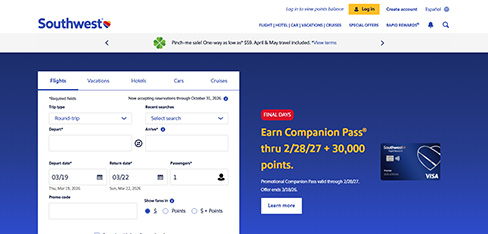
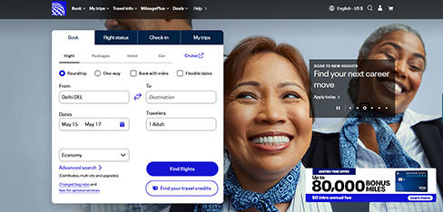
Expedia Group operates 200+ travel brands but each was independently tackling responsive design with wildly inconsistent results. Brands with poor mobile experiences were losing bookings not because of brand weakness but because of platform failure. UX Stalwarts architected a unified responsive platform that standardized mobile excellence across our entire portfolio. Growing average mobile conversion 73 percent and saving $37 million in development costs proved platform thinking beats brand-by-brand approaches. Bringing our lagging brands from 1.8 to 4.2 percent mobile conversion showed the power of shared responsive infrastructure. This is how platform companies scale quality.
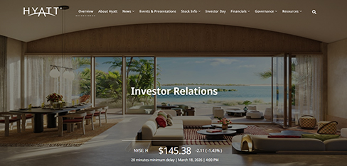
Hyatt had a responsive website but it was really a desktop site that barely worked on mobile. Mobile visitors could not effectively view our beautiful hotels, compare rooms, or complete bookings. We were losing 73 percent of our traffic to mobile friction. UX Stalwarts redesigned with adaptive responsive approach optimized for each device. Growing mobile conversion 142 percent and adding $670 million in mobile revenue transformed our digital business. The 234 percent increase in image engagement showed that mobile users needed different experiences, not smaller desktop layouts. This is how luxury hotels compete in mobile-first travel.
Considering a responsive redesign or a new build? Here are answers to the questions decision-makers ask most.
Start by reviewing their portfolio for projects similar to yours in complexity and industry. Ask how they handle breakpoint decisions, whether they follow a mobile-first approach, and what their testing process covers. Look for evidence of real device testing rather than emulator-only validation. A strong responsive design company will share performance metrics from past projects and explain their methodology clearly before asking you to sign anything. References from clients in your sector are valuable because responsive challenges differ significantly between an e-commerce catalog and a B2B lead generation site. When evaluating a responsive web design agency, also ask about their device testing labs and accessibility commitments.
Pricing depends on the number of unique page templates, the complexity of interactions, content volume, and whether you need a new build or a redesign of an existing site. A straightforward responsive marketing site with five to ten page templates might range from $8,000 to $25,000, while complex platforms with custom components, third-party integrations, and e-commerce functionality can exceed $50,000. The most reliable way to get an accurate estimate is to share your requirements with a mobile website design services company and request a scoped proposal. Be cautious of fixed-price quotes given before any discovery work has been completed. The best responsive web design company partners scope work transparently rather than committing to fixed prices upfront.
A typical responsive website development project for a mid-sized business takes eight to fourteen weeks from kickoff through launch. Factors that extend timelines include content creation delays, complex integrations, multi-language requirements, and stakeholder approval bottlenecks. Projects with clearly defined content and a decisive approval process tend to finish closer to the eight-week mark. We always provide a detailed project schedule after the discovery phase so both teams can plan resources around realistic milestones. An experienced responsive design agency will share weekly progress checkpoints so timelines remain predictable.
Responsive web design refers to the technical approach of building layouts that adapt to different screen sizes using fluid grids, flexible images, and CSS media queries. Mobile-first design is a strategy within responsive design that starts the design process at the smallest screen and progressively enhances for larger viewports. Creating a mobile first responsive web design means your smallest-screen experience is the foundation, not an afterthought. Most modern responsive design agencies use mobile-first as the default approach because it forces content prioritization and results in leaner, faster-loading pages across all devices. Creating a mobile first responsive web design also reduces the risk of bloated desktop-only assets sneaking into smaller viewports.
Google uses mobile-first indexing, which means it primarily evaluates the mobile version of your site for ranking decisions. A site that delivers poor mobile experiences through broken layouts, slow load times, or unusable navigation will rank lower than a competitor with a well-executed responsive design. Beyond indexing, responsive sites consolidate link equity into a single URL structure instead of splitting it between desktop and mobile subdomains. Responsive web design services directly support your SEO investment by ensuring the technical foundation search engines evaluate is strong across every device. Working with a responsive web design agency that understands mobile-first indexing helps protect your search visibility.
Our process is anchored in content-first breakpoint engineering and real device testing, not emulator screenshots. We define breakpoints based on your content and traffic data rather than applying generic device widths. Every build includes integrated WCAG 2.2 accessibility compliance, performance budgets enforced during development, and two weeks of post-launch monitoring. Most responsive web design agencies stop at launch. We continue measuring real-user behavior across devices to identify and resolve friction that only appears under live conditions.
The first step is a consultation where we review your current site performance, discuss your business objectives, and identify the scope of work. After that initial conversation, we provide a proposal outlining the recommended approach, timeline, and investment. Once approved, the project enters our discovery phase where we perform device analytics audits, stakeholder interviews, and content inventory. From there, you have full visibility into every phase through shared staging environments and structured feedback cycles. Top Responsive Web Design firms walk you through their discovery checklist before any work begins.
Yes. Responsive redesigns are one of the most common engagements we handle. We begin by auditing your current site to identify what can be preserved and what needs to be rebuilt. In some cases, the existing content management system and backend infrastructure can remain while the front-end is completely restructured for responsive behavior. In others, a full rebuild delivers better long-term value. We always recommend the approach that balances your budget with the performance gains your business needs. A capable Responsive Website Design firm will preserve content equity while modernizing the front-end stack.
Responsive website design is often most effective when paired with complementary services. We offer UX research and usability testing, UI design systems, front-end development, accessibility auditing, conversion rate optimization, and ongoing design retainers. Many clients begin with a responsive redesign and then expand into continuous UX improvement programs that iterate on design based on real user data. This connected approach ensures your digital product evolves alongside your business and your audience. Established Responsive Web Design firms typically bundle these as connected packages so handoffs stay clean.
Content-heavy sites require careful hierarchy management across screen sizes. We work with your content team to establish priority tiers, deciding which elements remain visible at every breakpoint and which can be accessed through progressive disclosure patterns like expandable sections or tabbed interfaces. Typography and spacing systems are calibrated so that long-form content remains readable on small screens without requiring excessive scrolling. Image and media strategies use responsive loading techniques to keep performance strong even on pages with dozens of assets. A skilled Responsive Website Design firm will balance disclosure patterns with information density on small screens.
We use progressive enhancement as our core development philosophy. This means the essential content and functionality of your site will work on older browsers, while modern browsers receive the full visual and interactive experience. During the validation phase, we test against a device and browser matrix that reflects your actual audience. If your analytics show meaningful traffic from older browsers, we factor that into our responsive design web development approach and ensure compatibility without compromising the experience for the majority of your users. Selecting the best responsive web design company means asking how they handle browser fallbacks during validation.
When executed properly, responsive design improves performance because it eliminates the need for separate mobile sites and reduces redundant code. Our builds use responsive image techniques that serve appropriately sized files based on viewport width, lazy loading for below-the-fold content, and minimal render-blocking CSS. Every project includes performance budgets that are enforced during development. We target strong Core Web Vitals scores across mobile and desktop, and post-launch monitoring confirms these benchmarks hold under real traffic conditions. Partnering with a proven mobile website design services company ensures performance budgets are enforced from day one.
Yes. After launch, we offer structured support plans that include device-specific performance monitoring, browser compatibility updates, content layout adjustments, and quarterly UX reviews. As new devices and browser versions enter the market, your responsive site may need minor refinements to maintain optimal performance. Our support engagements are designed to be predictable in scope and cost, so your team can budget confidently while ensuring your site continues to deliver strong results across every screen. Learn more about tracking the right UX performance metrics. A dependable responsive website design service should also clarify how layout adjustments are billed after launch.
Our mobile website design companies and responsive design work spans healthcare, financial services, e-commerce, SaaS, education, logistics, real estate, and government. Each industry carries specific responsive challenges. Healthcare projects often require compliance with accessibility and data privacy regulations on mobile interfaces. E-commerce responsive builds focus on product browsing efficiency and checkout conversion on small screens. SaaS platforms need complex dashboards that remain functional on tablets. This range of experience means we bring proven patterns to every new engagement rather than solving each problem from scratch. Experienced mobile website design companies bring sector-specific compliance know-how to every engagement.
No. Responsive design uses fluid grids and flexible components that adjust continuously across any screen width. Adaptive design detects the device type and serves one of several fixed-width layouts built for specific screen sizes. Responsive design is generally preferred for most business websites because it covers the widest range of devices with a single codebase and is easier to maintain over time. Adaptive approaches can be appropriate for highly specialized applications where distinct device experiences are necessary, but for the majority of responsive website development projects, a well-built responsive approach delivers better long-term value and lower maintenance overhead. Trusted mobile website design services document these trade-offs in plain language for non-technical stakeholders.

C – 81C, Sector – 8, Noida 201301, India


1025 Beamon Drive, Franklin 37064 Tennessee, USA
Sveavagen 34 111 34 Stockholm, Sweden
A-10, Sahastradhara Rd, Doon IT Park, Dehradun, Uttarakhand
© 2026 UX STALWARTS. All rights reserved.


