Most dashboards fail not because the data is wrong, but because the interface cannot communicate it effectively. When KPIs are buried under cluttered layouts, when charts compete for attention without clear hierarchy, or when users must click through five screens to reach a single metric, the dashboard becomes an obstacle rather than a tool. Poor data dashboard design services cost organizations more than wasted screen real estate. They delay decisions, obscure trends, create reporting bottlenecks, and erode confidence in the data itself. The interface determines whether information drives action or gathers dust.
Our dashboard UI design services resolve these problems through structured information architecture, deliberate visual hierarchy, and interaction patterns calibrated to how different user roles consume data. From analytics dashboard design for data science teams to executive KPI panels for leadership, we deliver wireframes, interactive prototypes, high-fidelity mockups, and production-ready component libraries. Every engagement begins with understanding what decisions the dashboard must support, who will use it, and how frequently data changes. That clarity ensures the finished interface serves genuine operational needs rather than displaying metrics for decoration.
With eighteen years of cross-industry design experience and over a thousand completed engagements, UX Stalwarts brings a level of dashboard design maturity that few agencies can demonstrate. Our teams have designed monitoring panels for healthcare platforms, financial reporting dashboards for compliance-heavy enterprises, and real-time operational views for logistics networks. That range of complexity sharpens every recommendation we make. When your organization needs a dashboard that performs under real operational pressure, the difference between a competent agency and one with deep domain exposure becomes immediately apparent.

We begin every custom dashboard design engagement by mapping the decisions each user role needs to make. Instead of asking what data to display, we ask what actions the data should trigger. This reversal produces dashboards where every widget, chart, and metric earns its placement through direct connection to operational outcomes.

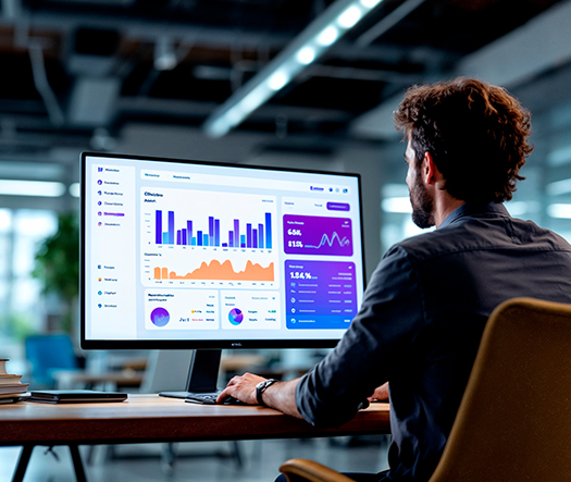
Effective data visualization dashboard design requires more than selecting the right chart types. It demands a structured visual hierarchy that guides the eye from summary metrics to supporting details through progressive disclosure. We design layouts where primary KPIs command attention instantly, while secondary data remains accessible without creating cognitive overload.

Enterprise dashboard design services require interfaces that adapt to multiple user types without duplicating effort. We create role-based views where executives see strategic summaries, managers see operational trends, and analysts access granular drill-down capabilities. Each role receives precisely the information density it needs, eliminating the noise that irrelevant data introduces.

Interactive dashboard design covers more than static chart displays. We design drill-down sequences, cross-filter relationships, date range selectors, and real-time refresh behaviors that let users interrogate their data without leaving the dashboard context. These interaction patterns transform passive data displays into active decision-support tools that respond to genuine exploration.

SaaS dashboard design services demand an understanding of multi-tenant architecture, subscription analytics, and usage-based metrics that general dashboard work does not require. We have designed SaaS dashboard UI panels for customer success platforms, marketing analytics tools, and project management applications where retention metrics and feature adoption drive product strategy.

Every dashboard we create connects to a documented component library with charting patterns, table styles, filter controls, and notification components that your development team can implement consistently. This design system approach ensures that new dashboard modules maintain visual and functional coherence as your product scales beyond the initial release.
A well-designed dashboard compresses the distance between raw data and informed action. When metrics are arranged with intentional hierarchy, when filters respond intuitively, and when visual patterns make trends immediately recognizable, users spend less time interpreting and more time deciding. Business dashboard design services achieve this compression by aligning every layout choice with the operational rhythms of your team. The value is not cosmetic. Organizations with well-structured dashboards report faster reporting cycles, fewer misinterpretations, and greater confidence in data-driven decisions at every level. Our team brings the UX discipline necessary to turn that potential into measurable outcomes.
Partner with dashboard specialists who understand your data and users.
Each phase produces validated deliverables that build on the previous step, ensuring that final designs reflect both user needs and data realities.

We conduct stakeholder interviews, audit existing reporting tools, and map the decision flows each user role follows. This phase identifies what data sources are available, what questions users ask most frequently, and what actions the dashboard must support. The output is a structured requirements brief that anchors all subsequent design work.

Information architecture determines how data is organized across dashboard views. We define navigation structures, widget groupings, data relationships, and drill-down hierarchies that match the mental models of each user role. Wireframe concepts are created to test layout assumptions before visual design investment begins. This phase prevents structural rework later.

Chart selection, color coding, axis formatting, and data density are calibrated for each metric type. We choose between bar charts, line graphs, heatmaps, sparklines, and tables based on what the data needs to communicate, not what looks most impressive. Every visualization choice is justified by the insight it enables.

High-fidelity UI mockups apply branding, typography, spacing, and component styling to validated wireframes. Filter controls, notification patterns, loading states, and empty-state designs are fully specified. Every interactive element is documented with hover, active, and disabled states so that developers can implement the dashboard without ambiguity or interpretation.

Interactive prototypes undergo usability testing with representative users from each target role. We measure how quickly users locate specific metrics, complete filtering tasks, and interpret trend patterns. Test findings are documented as design refinements, ensuring the dashboard performs intuitively before development investment begins. This phase catches misinterpretation risks early.

We hand off annotated Figma files, a component library with all charting and control patterns, responsive breakpoint specifications, and interactive prototypes. Post-handoff, we conduct design QA reviews during development to confirm that what ships matches the approved designs across browsers, devices, and data volumes.
Across 1,000+ client engagements spanning enterprise platforms, SaaS products, and operational tools, our dashboard interfaces have delivered measurable clarity improvements.
Our approach to data dashboard design services is grounded in two commitments: scalability that accommodates growing data volumes without requiring layout overhauls, and specificity that respects the unique reporting needs of each sector. Whether serving a healthcare organization monitoring patient outcomes in real time or a logistics company tracking fleet performance across regions, we calibrate data density, refresh intervals, and visualization types to match the operational context.
We have delivered enterprise dashboard UI design for healthcare, financial services, logistics, manufacturing, education technology, energy management, human resources, and marketing analytics verticals. Each industry carries distinct requirements around data sensitivity, compliance reporting, and user expertise levels. This cross-sector breadth allows our designers to apply validated dashboard patterns while customizing information hierarchy, interaction depth, and access controls for each engagement.

Designing effective dashboards demands more than chart-building skills. It requires a deep understanding of how people read data under time pressure, how information density affects comprehension, and how interaction design shapes exploration behavior. Our practice has earned client trust through consistent delivery of dashboards that compress decision time and increase data confidence.
Insight-Per-Second Design Philosophy: We measure dashboard effectiveness by how quickly a user can extract a meaningful insight, not by how much data is visible.
Multi-Role Information Architecture: Every dashboard we design accommodates multiple user roles through adaptive views, progressive disclosure, and permission-aware layouts that reduce noise for each audience.
Component-Ready Deliverables: Annotated charting patterns, filter controls, and table components are delivered as a reusable system, not isolated screen designs.
We use leading design, prototyping, and analytics tools to create dashboards that integrate seamlessly with your development workflow and data infrastructure.


Sixteen percent of treated water lost to leaks means billions of gallons wasted while utilities replace pipes based on politics rather than data. UX Stalwarts designed a dashboard that shows exactly where the water system is failing and where to invest. Non-revenue water dropping 14 percent across deployed utilities proves that infrastructure dashboard design directly impacts water conservation and public investment efficiency.
Petroleum engineers making billion-dollar reservoir decisions based on 12-day-old laboratory reports is an industry problem we can solve with better data delivery. UX Stalwarts designed a dashboard that gives clients live access to their analysis data with visual tools that accelerate understanding. Processing improving 38 percent and delivery accelerating to 5 days proves that laboratory dashboard design impacts the speed of the entire energy industry.
When a gas leak is detected, every minute matters. Phone trees and paper documentation during an emergency is dangerous. UX Stalwarts designed a dashboard that coordinates response in 45 seconds instead of 18 minutes and documents everything automatically. Response time improving 44 percent in natural gas operations is not a business metric, it is a public safety achievement.
Considering a dashboard design partner? Here are detailed answers to what teams ask before making a decision.
The best dashboard design agency will demonstrate a structured process that begins with understanding your data, users, and decision workflows before opening any design tool. Ask for case studies showing measurable improvements in data comprehension speed or task completion rates, not just visual portfolios. Confirm their experience with your specific dashboard type, whether analytics, operational, or executive. Evaluate whether they deliver documented component systems or just static screen designs. A strong UX agency for dashboard design will also show experience with role-based views, responsive layouts, and post-launch optimization support.
Dashboard UI design services pricing varies based on the number of user roles the dashboard must serve, the volume and complexity of data sources, the depth of interaction (static views versus drill-down and cross-filtering), and whether the project includes a full design system with reusable charting components. A focused single-view dashboard costs differently than a multi-panel enterprise suite with role-based access and real-time data. India-based agencies with strong UX capabilities typically offer competitive pricing relative to US or European firms at comparable quality. Request a scoped proposal with itemized deliverables for transparent comparison.
Timeline depends on complexity. A single-view analytics dashboard design with predefined data sources typically takes four to six weeks including research, wireframing, visual design, testing, and handoff. A comprehensive enterprise dashboard design spanning multiple user roles, real-time data integration, and a full component library may take three to five months. Projects requiring extensive stakeholder alignment, compliance considerations, or integration with legacy reporting systems may extend further. We establish milestone-based timelines during the requirements phase so that expectations are clear before design work begins.
Analytical dashboards are designed for data exploration. They feature deep filtering, drill-down capabilities, and comparative views that let analysts investigate trends and test hypotheses. Operational dashboards focus on real-time monitoring with alert thresholds, status indicators, and live data feeds that help teams respond to immediate conditions. Executive dashboards present high-level KPI summaries with trend indicators and strategic benchmarks that support leadership decision-making without granular detail. Our custom dashboard design engagements often combine elements from all three types within a single platform, adapting the view based on user role and access permissions.
Start with the decisions your dashboard must support, then work backward to the data required. Use consistent visual encoding so that colors, shapes, and positions carry the same meaning throughout. Apply progressive disclosure to prevent information overload by showing summary metrics first and revealing detail on demand. Limit each view to five or fewer primary metrics to maintain focus. Ensure responsive layouts that function on both desktop and mobile. Test with actual users to validate that they can locate and interpret key information quickly. These dashboard design best practices apply across analytics, operational, and executive contexts alike.
Yes. SaaS dashboard design services are a core capability within our practice. SaaS dashboards carry unique requirements including multi-tenant data isolation, subscription analytics, feature adoption metrics, and usage-based KPIs that general dashboard work rarely addresses. We have designed SaaS dashboard UI panels for customer success platforms, marketing analytics tools, and project management applications. Each engagement accounts for the product’s growth trajectory, ensuring the dashboard architecture scales as data volume and user count increase. Learn more about our broader B2B SaaS design capabilities for additional context.
Our enterprise dashboard design services span healthcare, financial services, logistics, manufacturing, education technology, energy, human resources, and marketing analytics. Each industry presents distinct data sensitivity, compliance, and user expertise challenges. Healthcare dashboards require HIPAA-aware data display patterns. Financial dashboards demand audit trail visibility and regulatory reporting compliance. Logistics dashboards need real-time GPS and fleet data integration. This cross-industry depth allows us to apply validated information architecture patterns while respecting the specific data governance and workflow requirements of each domain.
Our dashboard UX guidelines prioritize three principles: clarity, efficiency, and adaptability. Clarity means every data point has a defined purpose and a visual treatment that communicates its meaning without requiring a legend. Efficiency means users can reach any critical metric within two interactions from the landing view. Adaptability means the dashboard serves multiple roles through configurable views rather than separate builds. We also follow accessibility standards including sufficient color contrast ratios, keyboard navigation, and screen reader compatibility. These guidelines are calibrated for each engagement based on user research findings and data complexity.
Data visualization dashboard design starts with the question each metric answers, not the chart type that looks most appealing. We match visualization formats to data characteristics: time-series data gets line charts, categorical comparisons get bar charts, proportional distributions get treemaps or pie charts, and geographic data gets map overlays. Color is used semantically to indicate status, not decoratively. Data density is calibrated to user expertise so that analysts see granular views while executives see summaries. Explore how our UX research services validate visualization choices with actual users.
Yes. We approach dashboard redesigns as incremental improvement programs rather than wholesale replacements. We audit the current dashboard’s usage patterns through analytics and user feedback, identify the highest-impact areas for improvement, and roll out changes in phased modules. This approach preserves familiar navigation patterns while addressing identified pain points. For enterprise environments where sudden layout changes can disrupt established workflows, we provide transition documentation, contextual tooltips for updated components, and A/B testing of major layout changes before full deployment.
Understanding how to design data dashboards that achieve adoption requires focusing on three factors. First, match the default view to the most common task each user performs daily, so the dashboard provides immediate value without configuration. Second, minimize the learning curve by using familiar visualization patterns and consistent interaction behaviors throughout. Third, allow customization without complexity by letting users pin, reorder, or hide widgets without requiring technical knowledge. Dashboards that align with existing workflows rather than imposing new ones consistently achieve higher adoption rates across both technical and non-technical user populations.
Yes. Every dashboard engagement includes a documented component library containing charting patterns, table styles, filter controls, notification elements, and status indicators. This library is built within your design system so that new dashboard modules maintain visual and functional consistency as your product evolves. Components are documented with usage guidelines, responsive behavior specifications, and developer annotations. Our design system creation services ensure that these components integrate seamlessly into your broader product design language.
Interactive dashboard design refers to the patterns that let users explore data actively rather than passively viewing static charts. This includes drill-down sequences that reveal detail behind summary metrics, cross-filtering where selecting a value in one chart updates all related views, date range and segment selectors, hover tooltips with contextual detail, and real-time data refresh indicators. Interactive dashboards transform reporting interfaces into decision-support tools where users can investigate anomalies, compare time periods, and isolate variables without switching between separate reports or tools.
Enterprise dashboard UI design often involves aggregating data from multiple systems including CRM, ERP, marketing automation, and custom databases with inconsistent schemas and varying refresh intervals. We design interfaces that communicate data freshness clearly, handle loading states gracefully, and display fallback content when specific sources are unavailable. Our information architecture accounts for role-based access controls, ensuring sensitive data is visible only to authorized users. For compliance-heavy industries, we design audit-aware views that track which data was displayed and when. Our enterprise software design services provide the broader context for this work.
Contact us through our consultation form with a brief description of your data environment, the user roles your dashboard must serve, and your primary objectives. We schedule a discovery call to understand your data sources, current reporting pain points, and timeline. From there, we provide a detailed proposal outlining phases, deliverables, and investment. There is no obligation at the discovery stage. Whether you need a focused analytics panel, a comprehensive operational monitoring suite, or a full enterprise reporting platform, we scope every engagement to your specific data complexity and organizational requirements.

C – 81C, Sector – 8, Noida 201301, India


1025 Beamon Drive, Franklin 37064 Tennessee, USA
Sveavagen 34 111 34 Stockholm, Sweden
A-10, Sahastradhara Rd, Doon IT Park, Dehradun, Uttarakhand
© 2026 UX STALWARTS. All rights reserved.